

A brandbook serves as the source of truth for how a product should be represented visually and in writing. It's a living document that evolves as the product grows and matures, serving as both an onboarding resource for new hires and a collaboration reference tool for internal and external teams.
My experience leading Telekit, a new web-based phone application, gave me a unique opportunity to build a brandbook from scratch. The uncertainty and open-endedness was both scary and exciting as the product took shape. Although the brand book was developed in phases, the initial decisions around the color palette, typography, and other key design elements took about a month to research and finalize. The effort was led by the Senior Designer, with two additional designers contributing new content and refinements over time. The copywriter developed the brand style guide for written components of the brand book. The software development team consisted of the Technical Lead and six other developers. In this article, I want to explore how we built Telekit's brandbook as a product in itself: who are its users, what problems does it solve, and how did we measure success?
The problem
In Telekit's first month, the developers were ready to hit the ground running, but we had no designs for them to build. Basic questions became blockers:
- What color should the sign-up button be?
- How should the password error message read?
- What should the size and padding be for form fields?
- Do we want to build light/dark modes and what should our logos be?
With everything so uncertain, communication with the rest of the team was chaotic, and the cost wasn't just aesthetic inconsistency, it was lost time and effort. We were essentially asking teams to create art without showing them what it should look like.
Jobs to be done
When Telekit was being built, we focused on the minimum viable brandbook: a color palette, a readily accessible font, a logo that could evolve, and general voice and tone guidelines. Even though that seemed straightforward initially, I quickly gained appreciation for design complexities. For example, we needed two separate button interfaces for "Sign Up" and "Cancel" actions.
We reframed the purpose of a brandbook by defining key jobs to be done from each user's perspective:
Design
Decision-making: When debating whether to add animations to a button or change microcopy, we need clear design principles (not just examples) to guide decisions. It’s a place to catalog our brand evolution and the reasoning behind changes being made.
Internal reference: When a junior designer is asked to create logo variations for dark mode, they need existing color specs and formats to reference, so they can maintain consistency without constantly interrupting the lead designer.
Development
Translating design to code: When implementing a new component from Figma, we need exact specifications like hex codes, spacing values, font weights, corner radius so the product matches the design without playing "guess the shade of orange" or going back and forth with the designer.
Systematic updates: When the design team changes a color or adds a new icon, we need those updates documented in the brandbook first, so we can make systematic changes across the codebase instead of discovering inconsistencies in production.
Product
Creating marketing materials: When making social media posts for our LinkedIn business page, we need brand colors, icons, and templates readily available, so we can create content quickly without custom design work for every post.
Pre-release quality checks: When reviewing changes before a release, we need a way to quickly verify any off-brand colors, spacing issues, or tone inconsistencies, so we catch problems before customers do.
What we built (and why)
Since Telekit was a new SaaS product for small business customer service, we needed to build out both visual and voice identities. We prioritized visual identity because the product was highly interactive and required business owners to customize it to their specific needs on our web interface.
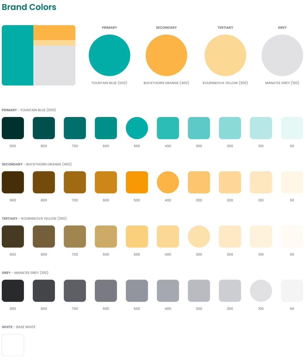
Color palette
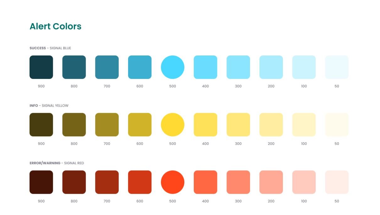
We established a three-tier color system: primary (blue-green), secondary & tertiary (orange), and neutral (light orange) colors, plus functional palettes for error (red), warning (yellow), and success (green) states. The UI designer ensured all combinations met accessibility requirements for contrast, saving us from having to retrofit accessibility later.
Typography
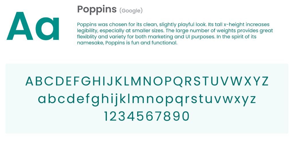
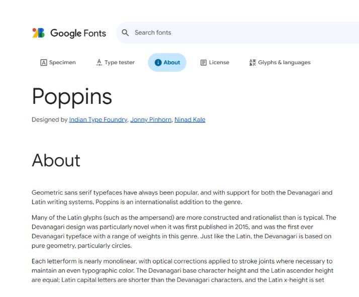
We picked Poppins, a sans-serif font from Google Fonts, for everything like headings, subheadings, body text, and buttons. Why Poppins? It loaded fast via Google's content delivery network, had an extensive library, felt modern, and was free with no licensing complications. We differentiated through font size, weight, and letter spacing rather than adding more fonts, which kept our CSS manageable.
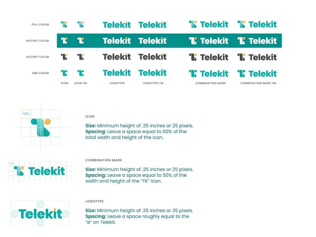
Logo usage
We created both an icon (a stylized 'TK') and a wordmark in three versions: full-color (blue-green with orange accents), monochrome (for dark and light backgrounds), and icon-only (for favicons and app icons). Technical specs covered minimum sizes, clear space requirements, and usage guidelines to prevent logos from being crammed, stretched, or placed on low-contrast backgrounds.
Voice identity
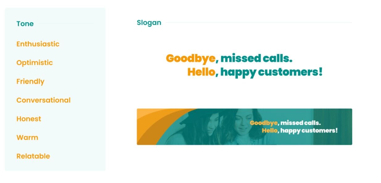
Through collaborative card-sorting with Brand Deck cards, we narrowed down to five core words: empathetic, approachable, professional, practical, and simple. Here's what each meant for Telekit:
- Empathetic: Acknowledging pain points directly with "Missing calls is stressful" not "You've missed 65% of calls this month"
- Approachable: Using contractions and second person, e.g., "You'll get a notification" not "Users will receive notifications"
- Professional: Being competent but not corporate, e.g., "We're here to help you!" not "We provide comprehensive support solutions"
- Practical: Favoring direct, action-oriented language and design with "Start from scratch" vs. "Build and customize your very own application"
- Simple: Removing complexities to make the design user-friendly for non-technical users, e.g., "Connect with Square" button vs. "Copy paste this code to integrate"
The copywriters defined specific grammar rules (Oxford commas, use of punctuation), capitalization standards, and tone variations for different contexts (simpler language for error states, more casual in onboarding).
For our tagline, we selected "Goodbye missed calls, hello happy customers" because it directly contrasts the pain with the benefit, making the value proposition immediately clear while maintaining an approachable tone.
What went well
Streamlined planning process: With design documents attached to JIRA tickets, developers focused on implementation and reduced time estimates by 1-2 days, increasing overall productivity.
Team retrospective: Positive team morale because the review process was smoother with less ambiguity about design decisions, reducing review time from a couple of days to a couple of hours in most cases.
Increased velocity: Design elements could be reused, and I could generate social media posts in 15 minutes instead of 2 hours or waiting for developer resources.
What needed improvement
Tracking changes: The early iteration was a PDF, which made it harder to share, track updates, export images, and view specs. We switched to Figma so it could live with the rest of the design documents and evolve as the product matured.
Assign an owner: I had the habit of editing design documents directly in the source file, adding information that hadn't been discussed or just breaking things. The designer cut me off by giving me read-only access. Now, any changes go through our ticketing system, and the designer makes the final edits and maintains the document.
Document became bulky: As more design elements were defined, it became difficult to differentiate brand guidance from implementation detail. We created a separate design system document that covered specific applications like drop-down menus, modals, and tables.
Takeaway
A brandbook isn't just a one-off design deliverable. It's a product that solves real problems for real users. Like any product, it needs user research (what questions do teams actually have?), thoughtful design (how do we make information findable?), and continuous iteration (what's working and what isn't?).
The best brandbooks aren't the most comprehensive ones. They're the ones people actually use. Focus on solving the top 10 questions your teams ask repeatedly, make those answers easy to find, and expand from there based on actual need, not hypothetical completeness.
Brandbooks should be accessible, easy to use, and genuinely enjoyable to reference. When teams reach for it instinctively rather than reluctantly, you've built something valuable.
Keep reading
How to start a sustainable product business: CEO Laura Crawford on growing her brand from scratch
UX that builds trust: What top fintechs get right
Netflix introduces major TV product redesign
Taste: The key to creating exceptional digital products