
The three design mistakes that turn engagement mechanics into a retention trap
As a product manager specialised in driving engagement on consumer apps, I've learned the hard way from gamification features that fail in ways that are entirely avoidable. But the biggest lessons came precisely from what I built wrong — and from noticing the same mistakes showing up across the industry.
Here is the core problem: gamification is supposed to increase retention, but, when badly designed, it actively drives away users who were already engaged. The problem is not with the concept, but the execution. Well-meaning teams end up designing gamification features destined to improve metrics, not user experience. This leads to two very differently designed briefs.
At its core, gamification is not a retention strategy. It is a trust system. Every mechanic you design either builds or erodes the user's sense that the product is on their side. That is worth holding onto as you read the rest of this.
When we were deciding whether to double down on our gamification features or pull back, the data was confusing. Engagement metrics looked strong. Users were interacting with the mechanics. But our Day 7 and Day 30 retention numbers were dropping. It took us longer than it should have to realise we were optimising for the wrong thing. The features that drove short-term engagement were quietly burning out our most loyal users.
To give you some context on what we were building: our product had two main gamification mechanics. A challenge feature — low effort, social, and genuinely fun — that let users participate in shared activities. And a virtual pet mechanic — where users could adopt a pet, keep it alive by feeding it regularly, and make it a personalised corner of their experience. On paper, the pet made sense: emotional attachment, a daily habit, a reason to come back. In practice, the two mechanics performed very differently, and understanding why is what this article is about.
This is a pattern that repeated across multiple products I've worked on: gamification that looked successful on a dashboard but was failing in the real world. Here is what I learned about why that happens and how to avoid it.
The visibility problem: Mechanics users can't see don't exist
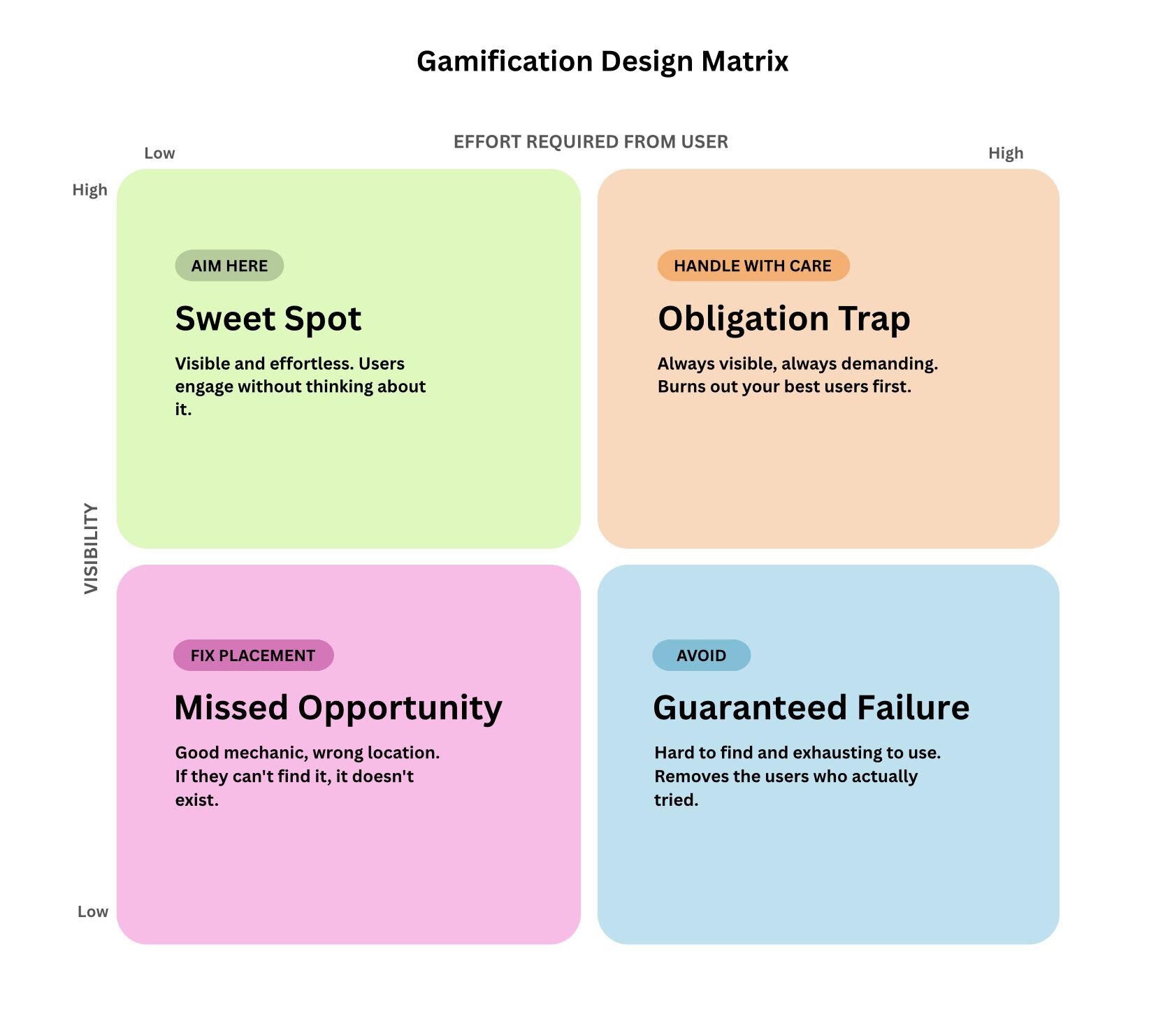
Before assessing a gamification mechanism's effectiveness, product teams need to find out if users can actually locate it. Most teams will spend zero time on placement but months creating the features. But what is the point of the feature if users can't even find it to use it? Adoption is a placement problem before it is a design problem.
There is no point building a feature the user has to hunt for. If the goal is to add value to someone's life through your product, that value has to be visible at the moment they need it, not tucked away somewhere logical to the product team but invisible to everyone else. As a PM, it's easy to be product blind because of how intuitive a feature is to you, since you are the one building it. But remember, the user has a completely different experience.
The takeaway here is this: visibility is not just about where something lives in the UI. It is about whether the mechanic appears at the moment of natural motivation, not when the product decides to surface it. Think about why people open TikTok or Instagram when they are bored: the product meets them exactly at the moment of low stimulation and high receptivity. Gamification mechanics need to work the same way. If a user has to go looking for the reward, the motivational window has already closed.
We saw this firsthand when engagement with our pet feature was a fraction of our challenge feature, not because pets were a worse mechanic, but because users had to actively remember to visit their profile to interact with it. The challenge feature, by contrast, surfaced naturally in the places users already were. By the time we moved the pet to a more visible placement, we had already lost momentum.
The obligation trap: When engagement becomes a chore
There is something I came across early on while studying self-determination theory (SDT) that fundamentally changed how I think about gamification. The goal is not to pull users back, but to make them want to return on their own.
SDT draws a clear line between intrinsic motivation, i.e. doing something because it is genuinely rewarding, vs extrinsic motivation, or doing something because of an external reward or pressure. The research is consistent: external pressures undermine intrinsic drive over time. This is known as the overjustification effect. When you reward someone for something they already enjoyed, you can actually make them enjoy it less. The locus of control shifts from internal to external, and the moment the external pressure disappears or becomes too heavy, so does the behaviour.
For product managers, this means that if your gamification mechanic is the only reason users are coming back, you do not have retention. You have dependency. And dependency is fragile.
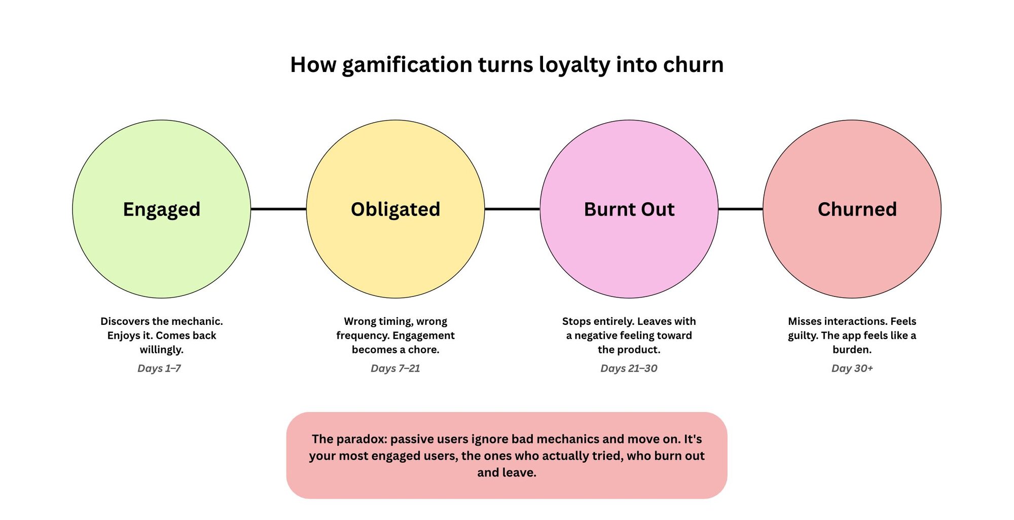
The moment a user feels obligated rather than motivated, the mechanic has crossed a line. Gamification that demands too much — wrong frequency, wrong timing, wrong effort level — does not just get ignored. It creates negative associations with the product itself. The user doesn't think, "I failed the game." They think "this app is exhausting" or "it's too much effort."
And the users most at risk are not your passive ones. Passive users simply ignore the mechanic and move on. Your most engaged users are the ones who try to keep up, burn out, and then leave carrying a stronger negative feeling, because they actually invested in it. You lose your best users first.
Here's a real example from the consumer social app I mentioned earlier.
I was using the app myself. I liked the pet. I fed it and I checked on it. For a while, it worked exactly as intended.
Then the feeding schedule started catching me at the wrong times. The pet would get hungry at odd hours, sometimes late at night, sometimes early in the morning. I would miss a feed. Then another. The pet would show signs of hunger and I would feel the low-level guilt of having let it down. It stopped feeling like a fun part of the app and became a responsibility that I had not signed up for. Emotionally taxing sounds dramatic for a virtual pet on a random app, but that is genuinely what it became.
So I stopped feeding it. And then, because the pet was gone, I stopped opening the app.
I was not a passive user who drifted away. I was someone who had been actively engaged, who had invested real time and attention — and the mechanic pushed me out anyway. That is the thing about obligation. It does not just fail to retain users. It actively removes the ones who were already there.
The hard lesson was that we built this feature based on what we thought would drive engagement (daily touchpoints, emotional attachment) without stress-testing whether the mechanic respected how people actually live their lives.
When we finally acknowledged the problem, we made three changes: we reduced the feeding frequency from twice a day to once, we added ways for users to interact with friends' pets (turning obligation into social play), and we made it easier to earn food and items by posting on the app, so the mechanic reinforced the behaviour we actually wanted (content creation) rather than creating a separate chore.
Retention among users who engaged with pets stabilised after these changes, but the damage had already been done to the segment of users who had invested time early on and then felt punished for being human.
The punishment paradox: Punitive mechanics target the wrong moment
So we now know that we don't want our users to feel obligated to stay, but we also don't want to punish loyal users at the wrong time and lose them forever.
Streak resets, lost progress, and hard drop-offs feel logical from a design perspective. You want to incentivise consistency, so you penalise its opposite. The problem is that in practice, these mechanics punish users at exactly the moment they are most recoverable.
A user who has not opened an app in three days is not gone. They are lapsed. There is a difference. Wiping their streak to zero at that moment does not re-engage them, it removes the only reason they had to come back. It also crushes their spirit.
The underlying mistake is that punitive mechanics are designed for an idealised user, someone who is consistent, motivated, and never has a bad week. Real users have jobs, get sick, go on holiday, and lose focus. Designing for the ideal user means systematically failing the actual one.
The biggest trap I fell into as a PM was trusting engagement metrics without questioning what they were actually measuring. High interaction rates with a gamification feature do not mean retention is improving. They often mean you have successfully created a hamster wheel that users feel compelled to run on until they burn out and leave entirely. The right question is not "are users engaging?", but "will the users who engage with this feature still be here in 30 days?"
Duolingo is a good example. Their streak mechanic is one of the most recognised retention tools in consumer tech, but for years, their hard reset policy was quietly driving churn. Miss a lesson and your streak resets at midnight. Lose a 200-day streak and you have lost your personal trophy, the visible proof of your consistency. For a lot of users, that was the moment they stopped coming back.
Their response was the streak freeze feature, which let users protect their streak using in-app currency, with the option to purchase more if needed. The result was a 21% reduction in churn. That is a significant number from one design decision, and the decision wasn't even designed to make the product more engaging. It was to make failure less punishing.
This is the principle: grace mechanics, streak freezes, and soft resets exist because the product's job at the moment of lapse is to lower the barrier to re-entry, not raise it. If your gamification punishes users for being human, you will lose them not in spite of your retention mechanics, but because of them.
What well-designed gamification actually does
After watching gamification backfire multiple times, and being the PM accountable for those failures, I developed a framework I now use before designing any retention mechanic. It's saved me from building features that look good in planning but die in production.
Gamification works when it is designed around the user's natural behaviour rather than the product's desired one. The difference sounds subtle but it changes every design decision you make.
The mechanics that tend to work share three properties:
The mechanics that tend to work should share the following three properties:
- They should meet the users where their motivation already lives. The best gamification amplifies what users already want to do rather than creating new obligations. On one consumer app I worked on, a challenge feature consistently outperformed everything else we built, not because it was the most sophisticated mechanic, but because it was low effort, social, and genuinely fun. It worked with the grain of user behaviour rather than against it. Users did not feel pushed. They felt like the app understood them.
- Make failure recoverable rather than punishing. The goal of any retention mechanic is to reduce the cost of returning after a lapse, not to maximise consistency. Inconsistency will happen;, and if it does, how do we make them come back? That is what you should be asking yourself.
- Treat visibility as a product decision, not a UI one. Where a mechanic lives determines whether it exists at all for most of your users. Placement is strategy, not detail.
Conclusion
Gamification is not a retention strategy. It is a trust system.
Every mechanic you design either builds or erodes the user's sense that the product is on their side. When gamification feels like manipulation, i.e. too demanding, too punishing, too invisible until it needs something from you, users do not just disengage from the mechanic. They disengage from the product.
The teams that get this right are not the ones with the cleverest reward systems. They are the ones who understand a user, their life and design for the user's actual life which is messy, inconsistent, and busy— not for the version of the user that looks good on a retention dashboard.
