Most digital teams say they “care about usability,” but when they need to justify a redesign or compare two products, they rely on soft signals: NPS, a SUS score, or few quotes from a lab study. These are useful, but they don’t answer the concrete question stakeholders ask: did we make the product easier to use in a way that predicts business outcomes?
There is solid evidence that user experience metrics do correlate with revenue. In a study of US airlines, Jeff Sauro compared Net Promoter Score, J.D. Power satisfaction, and Consumer Reports satisfaction against revenue two years later, and all three explained around 90% of the variation in growth, with Consumer Reports performing best as a predictor. That makes usability a leading indicator, not a cosmetic concern.
This article shows how to measure usability in a more rigorous and comparable way using the Single Usability Metric (SUM). We used SUM to compare Google Drive and Dropbox in a six-month volunteer case study – not to pick a winner, but to test the methodology in real conditions. Here we share what SUM is, how we applied it, where it broke, and what we would recommend to UX and product teams who want to go beyond “vibe checks.”
Why measure usability at all?
Designers usually accept that usability matters. The people who need convincing are executives, product owners, and IT leaders who must justify budget and scope. For them, the key point is simple: usability metrics are leading indicators of business metrics.
In Sauro’s airline study, three different satisfaction-style metrics – NPS, J.D. Power, and Consumer Reports – each showed very high adjusted R² values (roughly 0.90–0.94) when regressed against future revenue. Although each metric is slightly different, they all capture a mix of usability, service quality, and expectation management. When these numbers go up, revenue usually follows.
At the product level, usability failures show up as abandoned flows, longer handling times, and more support tickets. A drop from 85% to 60% task completion in a checkout flow has an obvious revenue impact. An onboarding flow that takes three minutes instead of one will show up in activation and retention curves.
Without metrics, organisations overreact to dramatic anecdotes (“we got a terrible review; we must redesign everything”) and underreact to systematic friction. Consistent usability metrics make it easier to prioritise based on impact instead of noise.
How teams usually measure usability
Most teams already have a patchwork of methods:
- moderated usability tests
- survey instruments like SUS, NPS, CSAT
- task-level items such as the Single Ease Question (SEQ)
- analytics funnels and feature usage
- support and operations data
Each method sees part of the picture. SUS and NPS provide broad sentiment but mix many factors beyond interface quality. Analytics show where users drop off, but not why. Qualitative tests surface issues, but make it hard to quantify progress over time or compare two products.
SUM was proposed by Sauro and Kindlund as a way to bring four core usability indicators – task completion, errors, time on task, and satisfaction – into a single, standardised score per task and per product, without losing the interpretability of each component.
What is SUM?
SUM (Single Usability Metric) combines four measures that map cleanly to ISO 9241’s definition of usability (effectiveness, efficiency, satisfaction):
- Completion rate – did users finish the task?
- Error rate – how often did they do something wrong?
- Time on task – how long did it take?
- Post-task satisfaction – how easy did it feel?
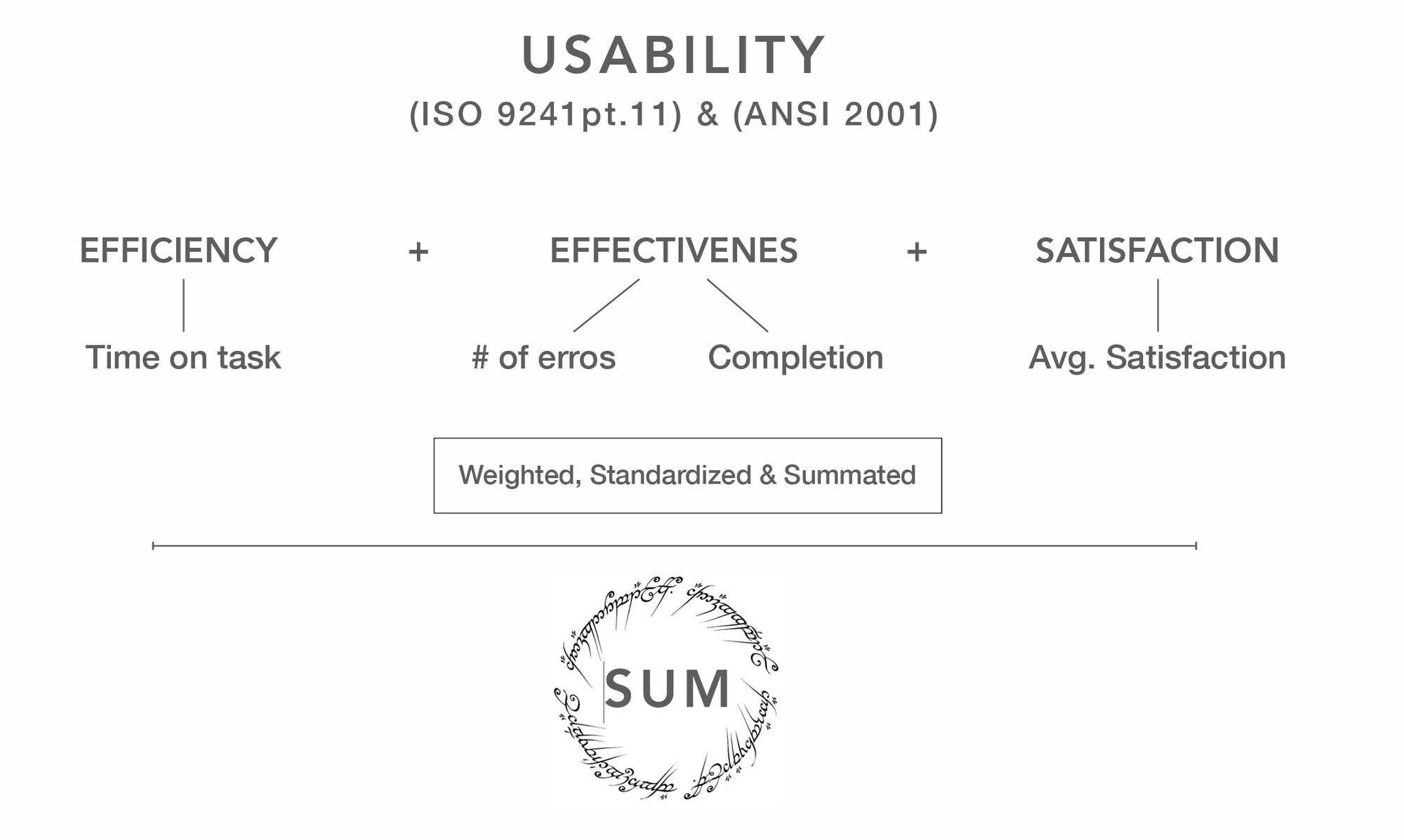
For each task, you turn these raw values into Z-scores relative to a specification limit or benchmark (for example, 78% as a “typical” completion rate, or a satisfaction score of 5 on a 7-point scale).¹ You then convert Z-scores into percentages and average them (with or without weights) to get a single usability score.
The value of SUM is that it forces you to be explicit about:
- what you count as “success”
- how you define an “error”
- what counts as “fast enough”
- which satisfaction level is acceptable
Once those are fixed, you can compare tasks, versions, and even competing products more fairly.
Our case study: Google Drive vs. Dropbox as a testbed
We ran a six-month side project to apply SUM to two widely used cloud storage products: Google Drive and Dropbox (web interfaces). Our goal was not to declare a universal winner, but to see how robust the SUM methodology is when you leave the textbook and work with real people and real products.
The setup:
- Scope. Common file-management tasks: creating folders, moving items, sharing content, and similar.
- Participants. Around 50 moderated sessions were run; after strict screening and excluding irrelevant users, 14 valid participants remained.
- Data collected. For each scenario, we captured completion, time on task, SEQ score on a 7-point scale, and detailed error logs.
- Outcome. We calculated the SUM per task and the overall SUM per product, and then compared those numbers to the qualitative findings.
We deliberately limited the number of tasks and participants. The purpose was to see whether SUM can produce stable, interpretable results for a realistic sample size, not to model the entire global user base of these products.
Step 0: Know your data types
SUM mixes continuous and discrete data, and this matters for how you analyse the results.
- Continuous-like data: time on task, satisfaction scores, and often error counts. They can take many values and be subdivided meaningfully (seconds to milliseconds, ratings to decimals).
- Discrete data: completion and conversion. Each individual either completes a task (1) or does not (0); only the aggregate rate becomes a percentage.
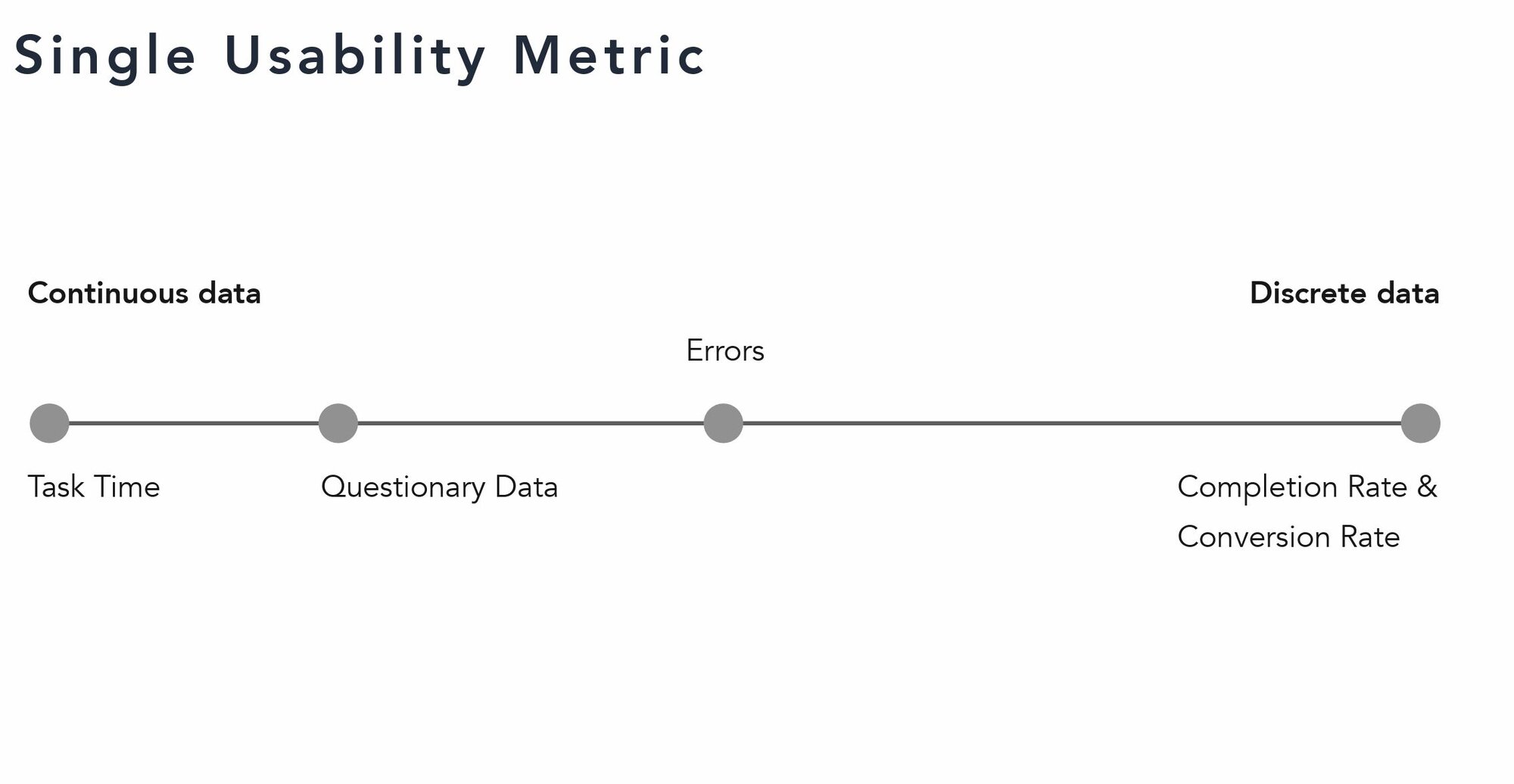
Continuous metrics usually produce smooth distributions and work well with means, standard deviations, correlations, and confidence intervals. Discrete metrics typically need more participants to stabilise.
For example, Sauro’s database of nearly 1,200 tasks shows an average task completion rate of about 78% across many products and domains; this figure is often used as a generic benchmark when no better baseline exists.
SUM is not fragile if you respect these differences: treat completion as a proportion, treat time and satisfaction as continuous, and think about how each is distributed before you run statistics on it.
Metric 1: Completion rate – “Can people actually finish?”
Completion rate answers the most basic question: can users finish the task? A task is coded as 1 (completed), 0 (not completed), or occasionally 0.5 for partial completion when that distinction is important.
In our study, we defined success, partial success, and failure for each scenario before testing began. For example, “find a specific shared file and add it to a folder” had clear criteria for success. We then built a simple matrix: participants as rows, tasks as columns, cell values of 1 / 0.5 / 0. Summing a column and dividing by the number of participants produced the completion rate for that task in that product.
Example of a task completion matrix
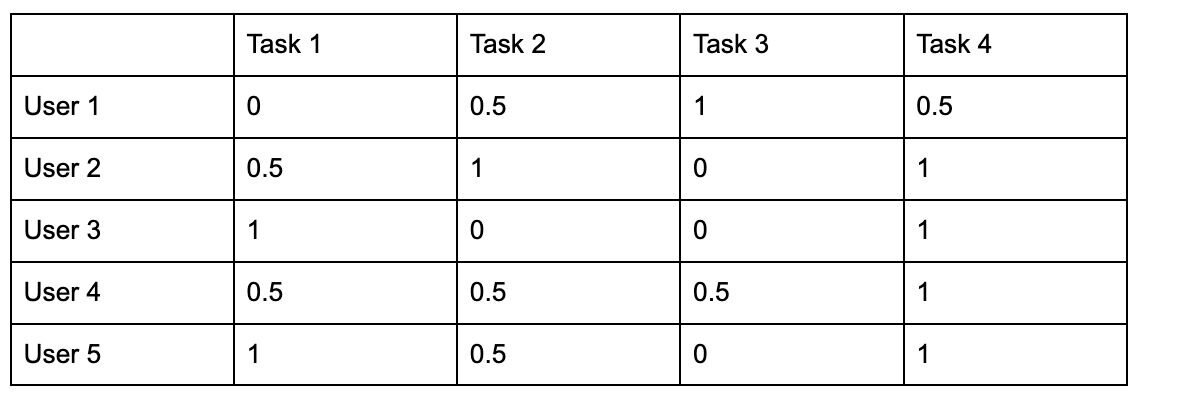 |
S – Success = 1
P – Partial Success = 0.5
F – Failure = 0
Completion rate is easy to explain to stakeholders and highly sensitive to serious issues. If only 20% of users can complete a key flow, no advanced statistics are needed to conclude that the experience is broken. SUM uses completion as one of its components by converting it to a Z-score against a benchmark (for example, 78% as “average”) and then turning that into a percentage.
Metric 2: Satisfaction – Capturing the feel of the experience
For post-task satisfaction, we used the Single Ease Question (SEQ) on a 7-point scale: “Overall, how difficult or easy was this task?” (MeasuringU – “10 Things To Know About the Single Ease Question (SEQ)”)
Three design decisions matter here:
- Scale length. Research comparing five-point and seven-point scales suggests that seven-point scales capture slightly more nuance without overloading users. The difference is modest, but seven points also avoid treating the middle (3 on a five-point scale) as “neutral yet slightly positive,” which can bias results.
- Specification limit. We treated 5 on a 7-point SEQ as the minimum acceptable score. This aligns with Sauro’s recommendations and other applied studies and keeps our results comparable with existing datasets.
- Z-score conversion. For each task, we calculated:

using sample variance (divide by n − 1). We then used a standard normal table or online calculator to convert Z to a cumulative probability and multiplied by 100 to get a percentage.
We experimented with a three-question post-task questionnaire (overall satisfaction, quality of information, satisfaction with time) but found that participants either gave identical scores to all three or spent too long trying to interpret the difference between them. That conflicted with our goal of capturing their immediate impression. SEQ alone gave cleaner, more consistent data with lower cognitive load.
Metric 3: Time on task – Efficiency with caveats
Task time is appealing because it translates directly into operational terms. If a support agent can complete a workflow in 45 seconds instead of 90, the impact is obvious. But it also raises recurring concerns: “don’t we need huge samples for time?”, “does think-aloud break the metric?”, and “which average should we report?”
Sauro and Lewis addressed these questions in a CHI paper on task times. They showed that for skewed time data and small samples, the geometric mean is often a better estimator of the “typical” time than the arithmetic mean or median.
In our study, we applied three rules:
- We excluded participants who clearly did not match the usage context or who failed to complete the task at all when computing specification limits.
- For those who did complete the task and reported acceptable satisfaction, we calculated the geometric mean of their times and used that as an estimate of “good enough” performance for that scenario.
- We converted each task’s observed times into Z-scores relative to that spec limit and then into percentages for SUM.
On think-aloud: previous research has found mixed results – some studies report slightly longer times, others no difference, and some even slightly shorter times when users verbalise their thoughts. The effect size is small. Our position is pragmatic: allow think-aloud, but avoid asking follow-up questions during the task and interpret time data with that context in mind.
When we looked at correlations between time and SEQ in our data, we saw the same pattern Sauro reports across thousands of tasks: a moderate negative correlation (around –0.5). Longer tasks tend to feel less easy and satisfying.
Metric 4: Error rate – Defining “opportunities to fail”
Error rate is conceptually simple – a ratio of empirical errors to opportunities for error – but in practice, it is the hardest component to define consistently. Two questions matter: what counts as an error? and how many chances to err did the user have?
We distinguished three categories:
- Interface problems. Errors caused by the design: misleading labels, hidden controls, inconsistent patterns. These are what we care most about.
- Scenario problems. Errors caused by artificial test conditions or unrealistic data (for example, unfamiliar account statements in a banking prototype). These are logged but not used to judge the interface.
- Slips. Mechanical mistakes (typos, accidental taps) that do not reflect misunderstanding. Following Don Norman’s distinction, we did not count slips in the error metric unless the interface clearly made them more likely.
The main challenge was defining error opportunities (O) in the formula:

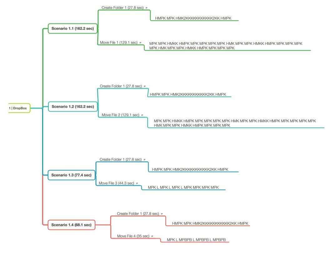
To make the definition of “error opportunity” reproducible, we documented each task as a small set of observed interaction paths (“scenarios”) rather than assuming a single ideal path. For each product and task, we reviewed session recordings and grouped repeated user behaviours into distinct scenarios (for example, several viable sequences for creating a folder and then moving a file).
We then represented each scenario as a structured sequence of interaction steps using a GOMS-style decomposition (in practice, a Keystroke-Level Model notation with operators such as M (mental preparation), P (pointing), K (keystroke), and H (homing)). The key value of this representation was not predicting time, but making decision points explicit.
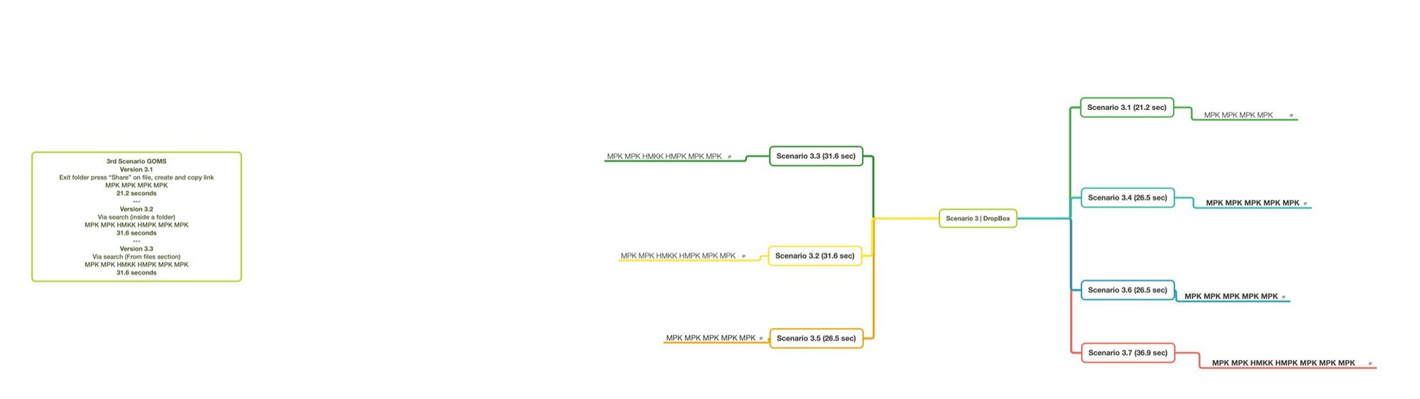
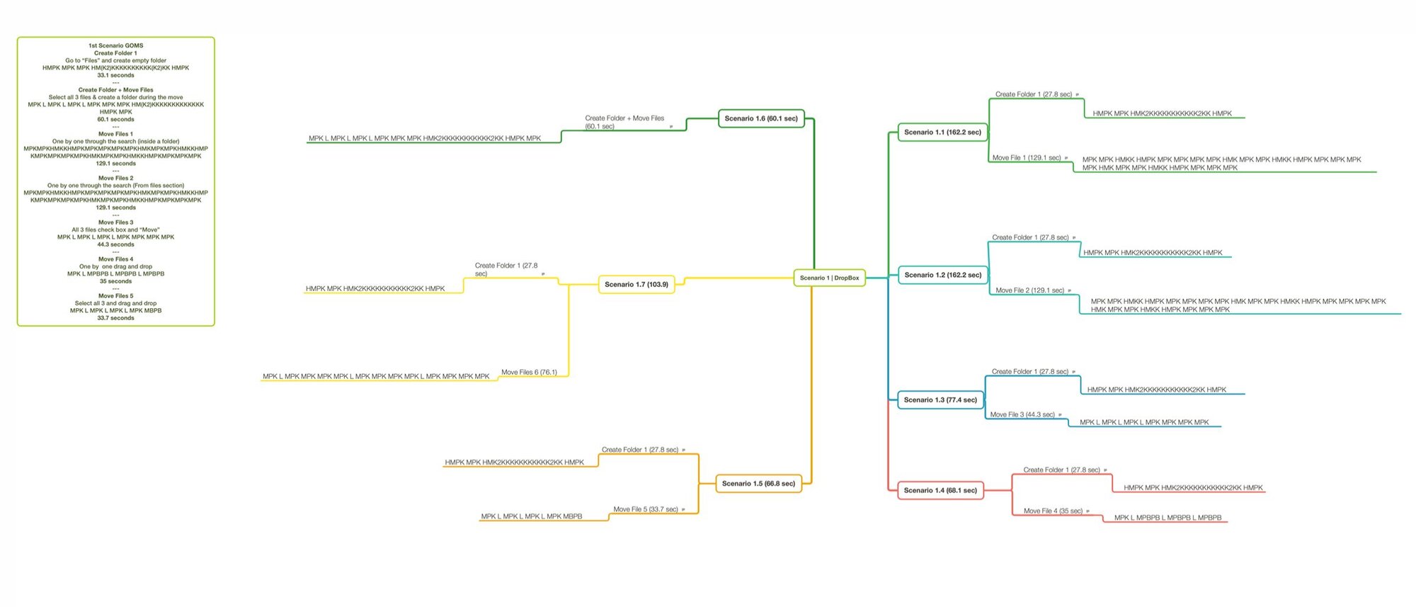
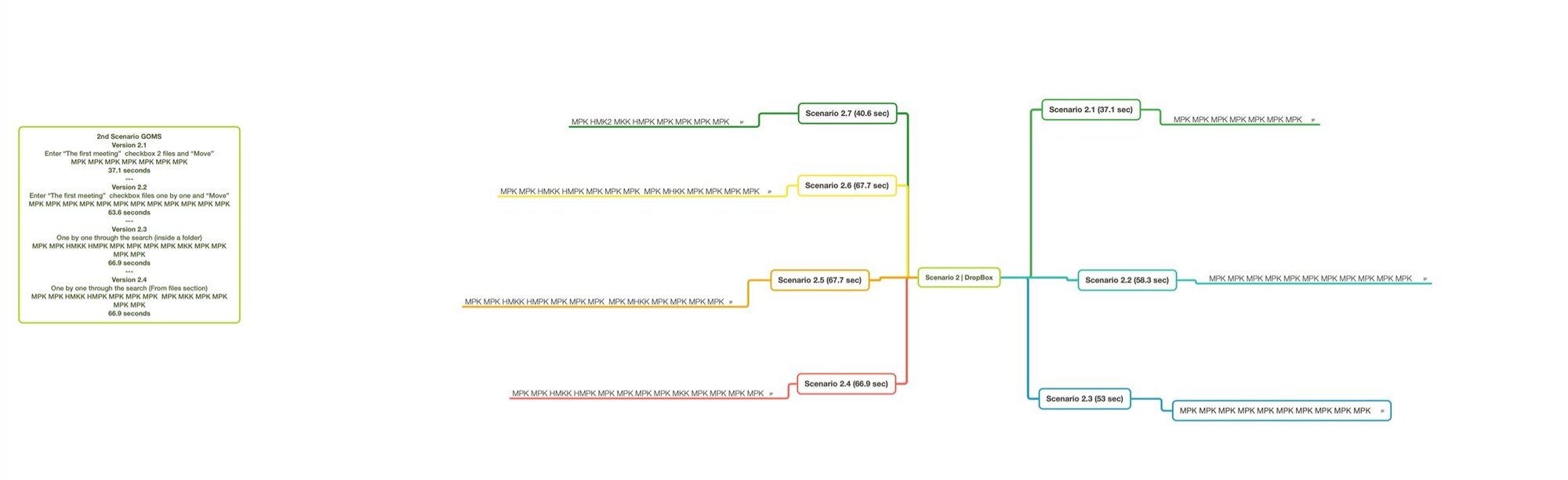
Our first naive attempt treated every interactive element on the screen as an opportunity. This produced absurd results: complex pages with many irrelevant actions looked “better” because the denominator exploded.
We replaced that with a decision-based definition:
- An error opportunity exists only at a point where the user must make a conscious choice between at least two plausible actions.
- We used a GOMS-style analysis of each real path observed in session recordings to count these decision points (“cognitive units”) per task. Each unit corresponded to one potential opportunity to go wrong, and the sum over a path gave us O for that path.
This definition was consistent with Sauro’s guidance, and when we shared our method with him, he confirmed it as a reasonable way to operationalise error opportunities for this kind of study. It also stabilised the metric: once we used decision points instead of raw UI elements, the extreme low and high error rates disappeared, and our graphs started to match what we saw in the videos.
What SUM told us about Google Drive and Dropbox
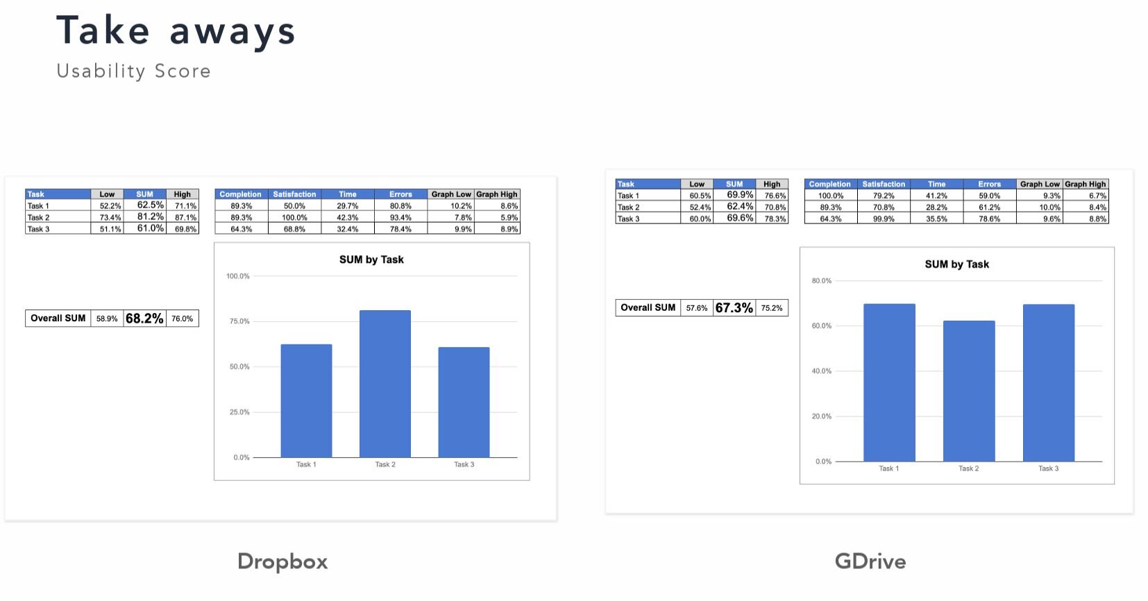
When we combined the four metrics into SUM scores per task and per product, we saw a nuanced picture:
- Overall, Dropbox’s SUM score was about one percentage point higher than Google Drive’s – effectively a tie in practical terms given our sample size.
- The component metrics told a more interesting story:
- Google Drive had slightly higher satisfaction scores on some tasks.
- Time on task was broadly similar between the two products.
- Google Drive showed a higher error rate in our chosen scenarios, which pulled its overall SUM down.
The qualitative observations matched these patterns. For example, in Dropbox, some users accidentally created shared folders when they intended only to move files, because the UI foregrounded sharing controls. In Google Drive, users often struggled to find the “Move” action, which was placed in a way that many participants overlooked. These details drove specific errors and extra time and showed up clearly in our metrics.
The main lesson was that SUM is most useful as a comparative tool. With a small, carefully defined sample and well-specified tasks, it gave us enough resolution to say “in these scenarios and conditions, Dropbox’s UI caused slightly fewer problems,” without claiming universal superiority.
When does a framework like SUM make sense?
SUM is not a universal default. In our view, it makes sense when:
- You need to compare two versions or products and want a defensible, transparent method.
- You work on complex systems where small improvements in completion, time, and errors scale to large business impact (CRMs, internal tools, multi-step enterprise workflows).
- Stakeholders expect a single headline number but you still want to keep the underlying metrics interpretable.
SUM is overkill when:
- The product is extremely simple (one or two actions) and basic completion and conversion metrics already tell you what you need.
- You are running early exploratory research with very small samples and rapidly changing designs, where qualitative insight is far more valuable than precise numbers.
You also don’t have to apply the full framework to benefit from the thinking behind it. A lightweight approach could track completion, SEQ, and time on task per scenario, with a clear error definition, and leave the formal SUM calculation for later.
How to start measuring usability in your own product
If you want to bring more structure to usability measurement without turning it into a statistics project, a practical path looks like this:
Select three to five critical flows. Focus on tasks that matter directly to your product’s success (activation, key transactions, core internal workflows). Make sure each has a clear, observable success criterion.
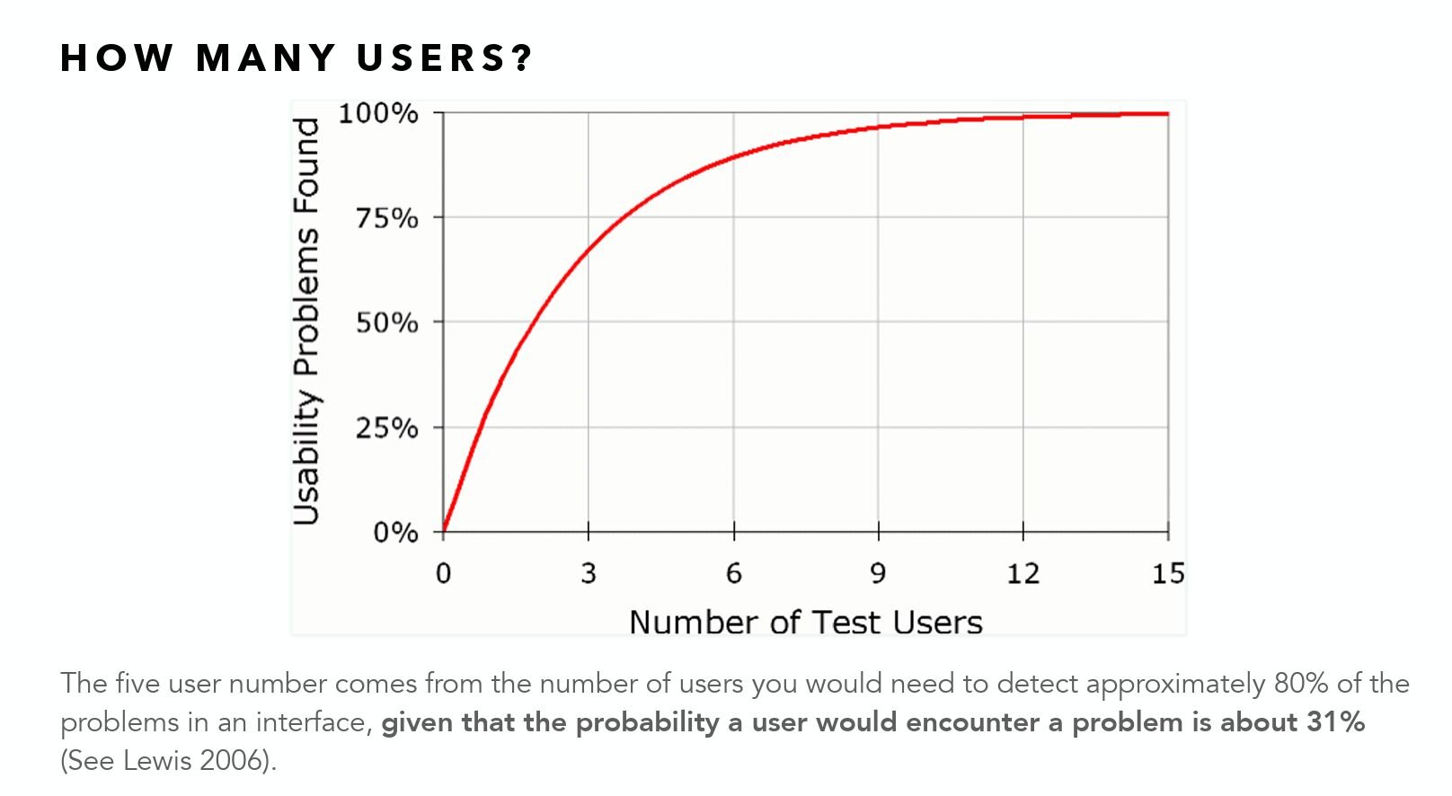
Recruit 12–20 relevant users. Screen for people who match your actual audience. If you want statistically meaningful metrics, five users are not enough; the often-quoted “five-user rule” from Nielsen Norman Group applies only to exploratory qualitative testing, not to quantitative inference.
Run moderated sessions and collect four metrics. For each task, note completion (1 / 0 / 0.5), ask SEQ on a 7-point scale, record time on task, and log errors according to a documented definition of “error” and “error opportunity.”
Analyse with simple tools. Use a spreadsheet to compute completion rates, geometric means for time, SEQ means and standard deviations, and basic error rates. If you want to follow SUM strictly, convert each metric to a Z-score against a chosen benchmark or spec limit and then to a percentage using a Z-table or an online calculator.
Present both the composite and the components. If you calculate an overall SUM score per task or product, use it as a summary, not as the only result. Show how completion, errors, time, and satisfaction differ between tasks and versions, and connect those differences to specific design issues seen in recordings.
Over time, repeating the same measurements on new releases will give you your own internal benchmarks, which are far more persuasive in stakeholder conversations than one-off lab results.
Conclusion
Usability is measurable in a way that links directly to how products perform in the market. Frameworks like SUM don’t replace qualitative insight, but they give designers and product teams a way to quantify usability across key scenarios and to compare versions and competitors with a level of rigour that stakeholders understand.
Our Google Drive vs Dropbox study showed that with a modest sample, careful definitions, and straightforward statistics, you can move beyond “this feels better” and start making evidence-based claims about how usable your product is, where it falls short, and which changes are likely to produce real gains – for users and for the business.