
In my previous article, Designing decision infrastructure, I described how we at Kinertic — a reporting, procurement, and commercial insights platform for emission-differentiated commodities — arrived at a canvas-based interface model while building Trade Flow Builder, the module that lets users map how a product moves through a multi-tier supply chain and calculates its carbon intensity at every step. The business problem behind it is concrete: companies in industries like oil, gas, and metals increasingly have to account for the carbon intensity of their products to meet emerging regulations such as the EU Methane Regulation (EUMR) and the Carbon Border Adjustment Mechanism (CBAM) — and by modelling their supply chains, they can anticipate the regulatory cost they face and build lower-carbon, more competitive flows that ultimately save them money. That piece focused on the interface itself — a full-screen, node-based canvas where users build a trade flow visually rather than filling in a form field by field — and on why the canvas became not a cosmetic choice but a reflection of the logic of the domain.
In this article, I want to look at the other side of the same case — the process behind it. A polished final interface always looks self-evident once it has been built; but behind it usually stand months of discussion, discarded hypotheses, and architectural pivots without which the solution would never have emerged. In our case, the decisions that shaped the path from the first prototype to the canvas were not visual edits but operational practices the team developed internally.
At Kinertic we treat the product process as a discipline in itself. This matters especially in an early-stage environment, where a first version of a product has to be built without a live user base: in such conditions, an architectural mistake in a core module can cost the team weeks of misdirected work, and the safeguard against it is not intuition but the structure of the decision-making process itself.
In what follows, I want to unpack three things: how we built our early-validation process, which we refer to internally as Fast-Ideation; how it allowed us to recognise — and step away from — the first, deceptively familiar interface we tried in favour of a full-screen canvas; and how the domain itself, not just the interface, dictated the tree-like structure that canvas needed to represent — a structure that turned out to directly support compliance with regulatory standards such as EUMR and CBAM.
Part 1: Pre-reads and lo-fi validation as a way to fail early
In an early-stage startup, what matters most is the speed at which the team can let go of hypotheses that do not work. When you have no live users, no market data, and no clear view of the competitive landscape, the only practical way to reduce risk is to raise the density of validation that happens inside the team. This is the role that the process we call Fast-Ideation is designed to play.
The underlying idea is straightforward: every significant product decision should pass through three filters — domain expertise, technical feasibility, and a market-fit scenario — before it enters the development backlog. In practice, this means that for every architectural discussion the people responsible for each of those filters should be in the room, and they should arrive with a shared factual baseline.
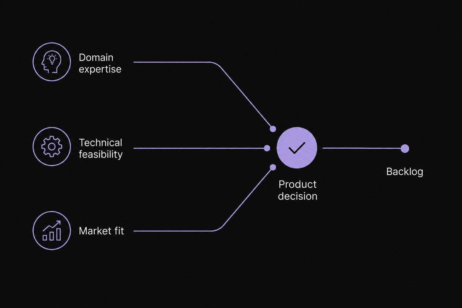
A Fast-Ideation triangulation: every product decision is validated against three filters — domain expertise, technical feasibility, and market fit — before it enters the backlog.
To make this work, before the first ideation session for any new feature, our CTO and Product Manager prepare a document together that we refer to as a pre-read. It is a one- to two-page brief in Notion that captures the early business scenarios, the domain knowledge gathered from external stakeholders, and the technical and product constraints known at that point. The document is shared with the entire team several days ahead of the meeting. By the time the session takes place, the team is no longer encountering the problem for the first time — everyone arrives with their own hypotheses, questions, and risks.
The most visible effect of this mechanism appears at the second level. Without a pre-read, a significant share of the first meeting goes into context alignment: what we are actually discussing, who the user is, where the boundaries of the task lie. With a pre-read, that phase is already behind the team — a discussion that would once have required three meetings now happens in one, without losing depth.
A pre-read is not produced ahead of every meeting, only ahead of the first one on a new module. After that, the document lives as a shared artefact: after each subsequent session we return to it and rewrite the parts that have become outdated. In effect, the pre-read provides an informational foundation but does not propose a solution — the solution emerges inside the team, through discussion.
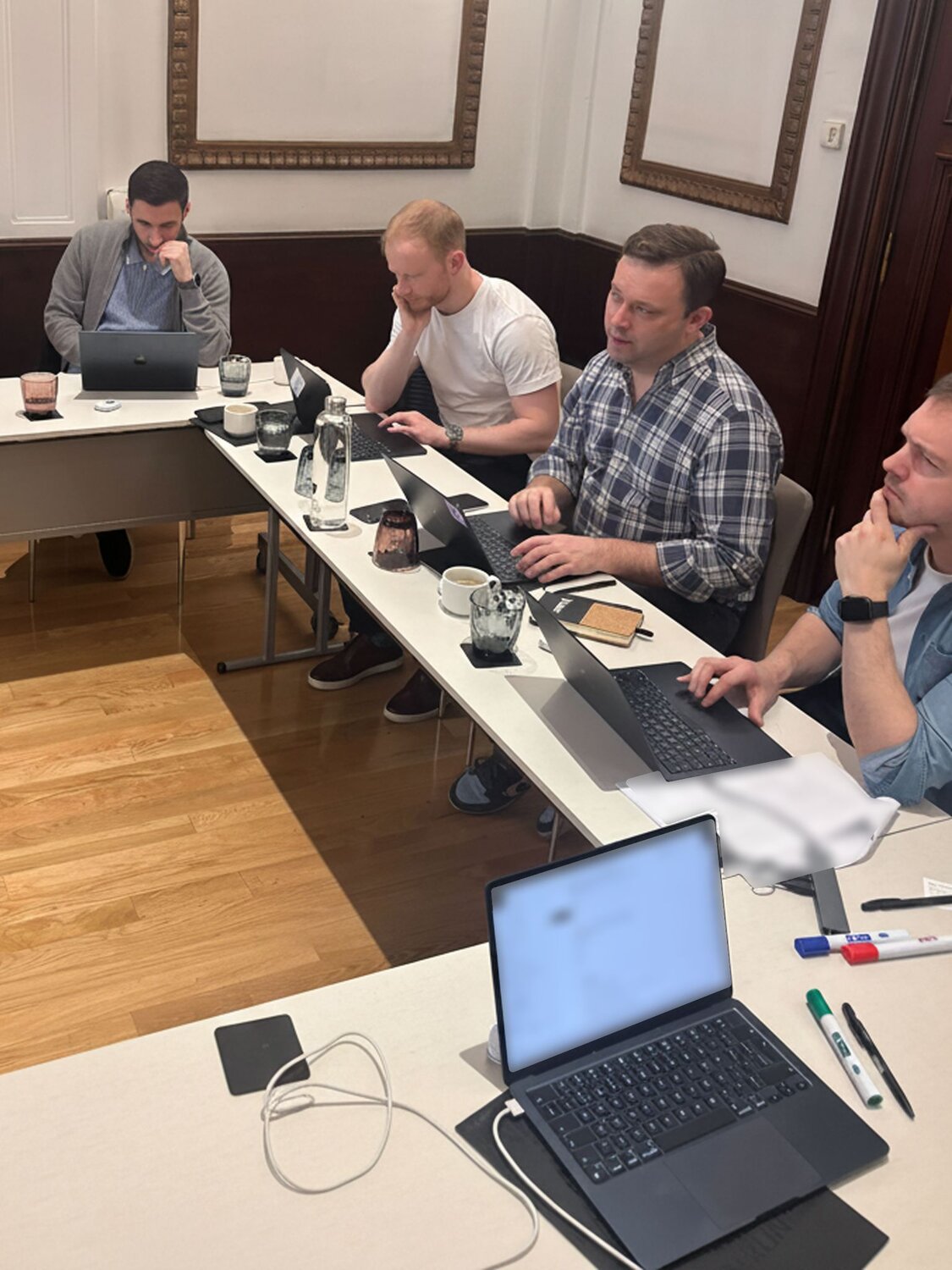
A Fast-Ideation session in progress: the team works through a new module together after reviewing the pre-read.
My role as a designer within this process is twofold. On one hand, I bring lo-fi concepts into the ideation sessions — usually sketched in FigJam or Excalidraw, the latter being the more familiar tool for our engineering team — deliberately low in detail so that the team discusses structural logic rather than visual style. On the other, after the session I am responsible for translating the outcomes of the discussion into design specifications that account for the underlying data schemas the engineering team relies on. At Kinertic, I am the only designer on an engineering-heavy team, and this puts the design work on the same level of responsibility as the engineering work: a specification has to be not a visual proposal but a working blueprint.
It was this process that allowed us to see the problem with the first Trade Flow Builder prototype before we had committed engineering resources to it. The solution we started with looked familiar and seemed reasonable at first glance. The understanding that it would not scale to our task came from passing it sequentially through all three filters — domain, technical, and scenario-based.
Part 2: Sidebar as a familiar pattern, and where it stopped working
The first version of Trade Flow Builder we worked on — Kinertic's tool for mapping carbon intensity across multi-tier supply chains — was a hybrid. The main area of the page was occupied by a map showing the user all available assets — refineries, ports, terminals, airports. Over the map, on the right-hand side, a sidebar slid out in which the user configured a trade flow: setting its name and description, defining a sequence of logistics legs — individual route segments from one asset to another, with the transport mode, the product, and the parameters used to calculate carbon intensity. Below the map, a summary table listed all the trade flows that had already been created.
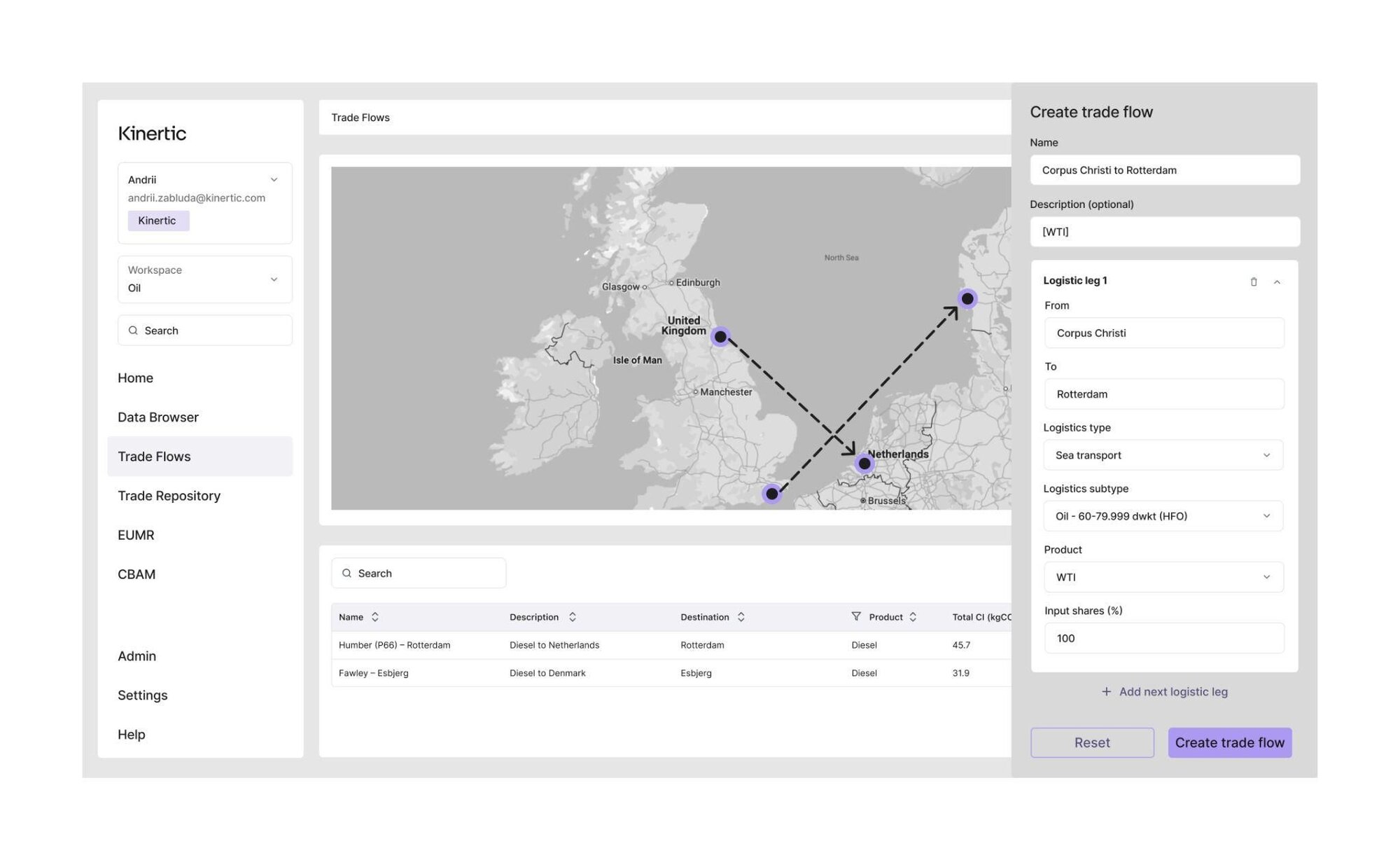
Early Trade Flow Builder prototype: a hybrid model with a sidebar over a map and a summary table of trade flows below.
We chose this layout for two reasons that seemed reasonable at the time. First, in the physical world of logistics and supply chains, a great deal of context lives on the map itself — assets, routes, and the geographical relationships between them — and this made a map-first layout the natural starting point for an interface designed around trade flows. Second, we drew on a familiar interaction pattern from products like Google Maps, where selecting an object opens a side panel with its details.
The friction point appeared when we started to walk through scenarios in detail. In all the references we had been leaning on, the sidebar served as a data summary — a space in which the user reviewed brief information about a selected object. After the click, attention moved from the map to the panel, and the task usually ended there. In our scenario, the sidebar was supposed to play a fundamentally different role: it had to be a space of deep configuration, in which the user constructed a complex, multi-level structure.
A typical trade flow in our domain consists of several logistics legs, and each segment requires its own set of parameters: transport mode, product type, fuel type, and other variables that feed into the final carbon-intensity calculation. Configuring such a structure inside a narrow vertical panel, without any visual representation of the flow as a whole, was not workable. The sidebar turned into an endless form in which the user lost track of which segment they were on and how their current decisions related to the rest of the flow.
On top of that, another layer of the problem emerged. Placing the map and the table of existing trade flows on the same page as the configurator created a conflict of user tasks. Reviewing assets on a map and scanning existing flows is one task, requiring context and spatial awareness. Constructing a new multi-level flow is a different task, requiring focused attention on structure. Combining them on a single screen simultaneously increased cognitive load and reduced the efficiency of each. The map on this page was not helping the user; for the configuration task, geographic positioning is secondary at best.
We could have recognised this in the finished interface much later, during user testing. But through the Fast-Ideation process, examining the first prototype through the domain, technical, and scenario filters, it became clear before development began that we were trying to combine two fundamentally different user jobs-to-be-done on one screen: monitoring assets and modelling structure. That conclusion called not for a local sidebar revision, but for a change in the architecture of the feature as a whole.
Part 3: From linear chains to consolidation structures
Moving the construction of a trade flow onto a dedicated canvas screen opened the next question: how exactly should the canvas represent the structure of a flow? The answer came not from interface considerations, but from the domain itself.
Working with stakeholders and through the pre-read documents, we gradually arrived at a concept that in the oil industry is known as a crude slate. A crude slate is the specific mix of crude oil grades that an individual refinery purchases and processes, in fixed proportions. One refinery might work with five grades; another with twenty. Each grade carries its own carbon intensity, and the final product — diesel, jet fuel, fuel oil — inherits an averaged footprint determined by the shares in which the raw material was blended at the input.

Early notes exploring the crude slate concept — different crude grades blended in proportions to produce a final product.
The same logic can repeat further down the chain. Jet fuel produced by a refinery is delivered to an airport; and if that airport sources fuel from several refineries at the same time, the final product in its tanks is itself a new consolidation. The structure of any given trade flow depends on how the supply chain is actually built: some flows turn out to be fully linear, while others contain one or several points of consolidation.
This leads to a simple but important observation: a trade flow in our domain is not always a line — it is a tree-like structure with many-to-one relationships, and any interface that represents it as a linear sequence of steps distorts in advance the way the flow is actually shaped in reality.
This observation defined how the canvas had to behave. Every asset — refinery, port, airport — becomes a node. Every logistics leg becomes a connection between nodes. Multiple sources can converge into a single node, and the user sees the entire structure at once: which assets participate in the flow, how they are connected, where consolidation occurs, and how much each node contributes to the final carbon intensity. Configuration of an individual node or connection now opens in the right-hand sidebar — but in the role that a sidebar is actually well suited for: deep configuration of a single element, not of the whole structure.
We chose React Flow as the technical foundation for this layer — a library natively designed for node-based interfaces, which manages the position of nodes automatically, based on the data structure rather than manual placement. That choice mattered more than it appeared to at the start. It addressed several questions at once: the design gained predictable visual consistency as the complexity of a flow grew, the engineering team gained a manageable state model, and the user gained the guarantee that the same flow always looks the same, regardless of who built it.
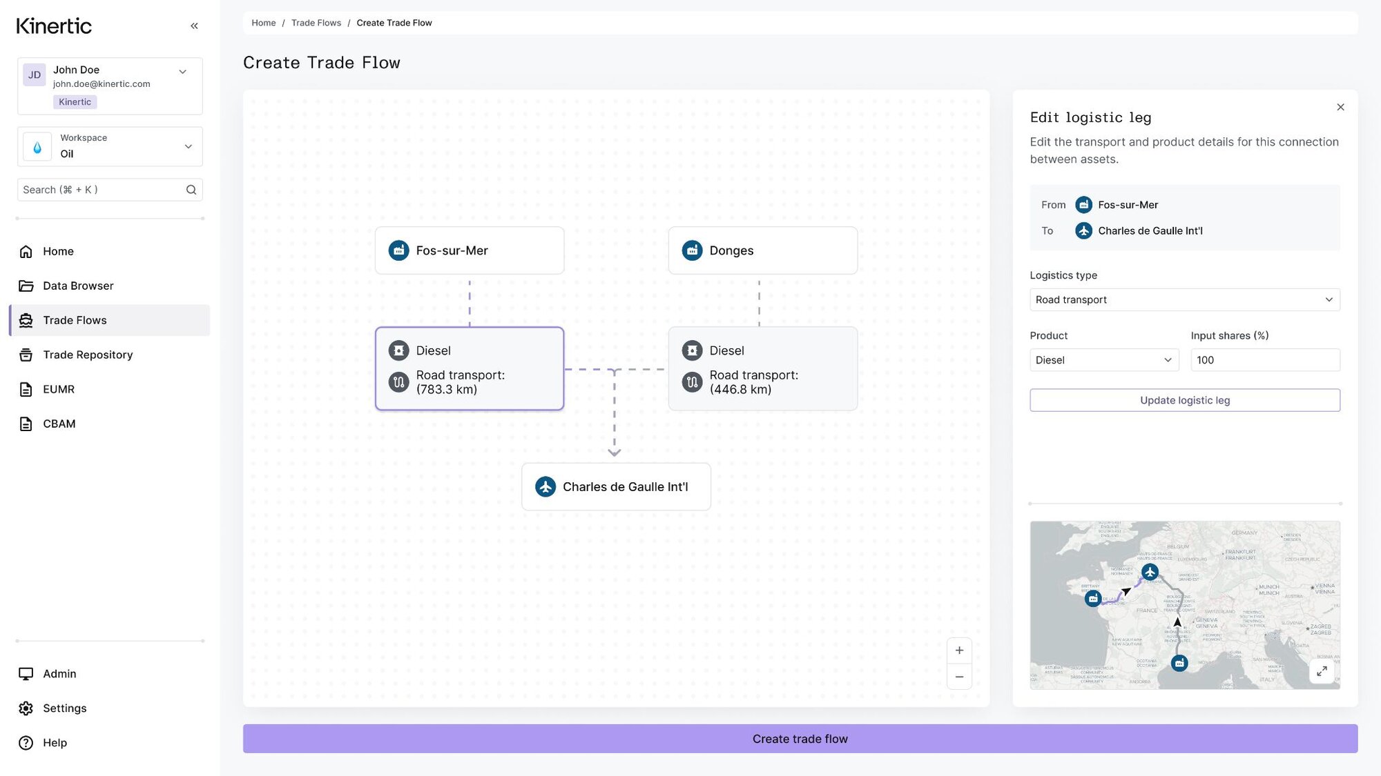
The final canvas built on React Flow: assets appear as nodes, logistics legs as the connections between them, with configuration handled in a contextual side panel.
There is one further consequence we did not originally set out to achieve, but which fell naturally out of the chosen model. The tree-based representation lets the user see directly how blending batches from different refineries affects the final emissions intensity of the end product. This turns Trade Flow Builder into a tool that not only describes existing flows but also helps companies meet emerging regulatory standards — most directly EUMR for the oil and gas sector and CBAM for imported goods. What in the first version could have become a separate compliance feature became, in the final architecture, a natural by-product of the structure of the interface itself.
Structure follows domain
The most valuable lesson I take from working on Trade Flow Builder does not sit in design or in process alone, but in how the two are connected. The final canvas-based interface I described in the first article, and the operational practices I described here, are not two independent decisions. They are two expressions of one principle: both the architecture of the interface and the architecture of the process should follow from the structure of the domain, rather than being imposed on it from above.
In the first article, this principle showed up in the fact that the canvas model emerged not as a stylistic choice, but as a reflection of the fact that a trade flow itself is shaped as a tree-like structure. In this one, it shows up in the fact that Fast-Ideation works not because it is efficient in general, but because it matches the character of the problems an early team in an expertise-heavy domain has to deal with. These are problems in which a mistake in the architecture costs more than a mistake in execution, and where the principal risk is not a poor implementation, but a correct implementation of the wrong model.
The payoff of this way of working was real, even if it did not show up as a number. Catching the sidebar problem during Fast-Ideation, before it reached engineering, likely saved us on the order of two to three weeks of development that would otherwise have gone into building the wrong architecture. The pre-read practice had a subtler but arguably larger effect: it noticeably reduced the friction between the engineering team, myself as the designer, and the founding team, because everyone arrived at a new feature already grounded in the same context rather than negotiating it in the room. And the move to the canvas model was received well internally — not because it was elegant, but because it genuinely improved the experience of building trade flows manually. One honest caveat belongs here: at this stage we had no live users to validate against, which is precisely why the internal process had to carry the weight external feedback usually would. The rigour of fast-ideation was not a luxury; it was the substitute for a validation loop we did not yet have.
Two more general observations follow from this, which I believe travel beyond Kinertic. The first is that the operational practices of an early team cannot be chosen by default. Pre-reads, lo-fi validation, the triangulation of filters — none of these is a universal template; they work when they fit the structure of the task. A team operating in a mature domain with known users needs a different process than a team building the first product in a new segment. The second is that in DeepTech and domain-heavy B2B products, the designer's role extends into the territory of systems thinking. When the final interface is so tightly tied to the structure of the domain, there is no longer a separate task of "drawing the UI" — there is a task of bringing the model of the domain, the model of the data, and the model of interaction into a single coherent artefact. This work takes place before the first line of front-end code, and most of it is not visual.
For me, as a Founding Product Designer at an early-stage company, this means a simple thing. Design in such conditions ceases to be a phase of execution and becomes a point of alignment. Its task is not to make the interface comprehensible, but to make the team's shared model robust enough that the interface follows from it almost automatically.
