In the 30-90 days after launching a product, it’s surprisingly hard to make a true judgement about product-market fit. Most often, early signals are subtle and not obvious. You’re rarely going to see the hockey stick growth or viral attention to confirm your instincts.
I've spent fifteen years building products across fintech, retail, travel, and most recently at Bolt.New, where the pace of user growth has forced me to get much sharper about reading early indicators.
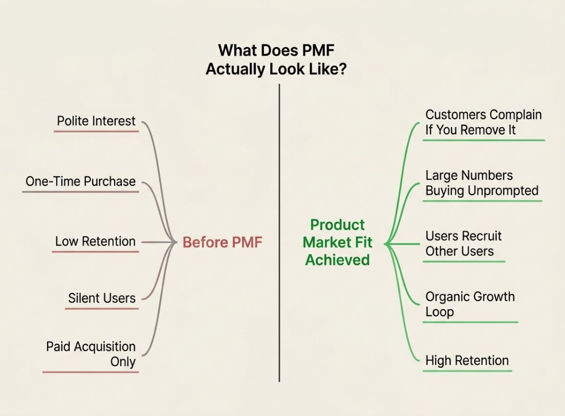
Most product teams are calibrated to spot problems: a retention drop, spike in churn, or lack of adoption. We build dashboards around the metrics we can defend in a planning meeting—velocity, NPS, delivery against roadmap—and we get very good at watching those specific dials.
What we're less good at is noticing anomalies that don't fit the dashboard. PMF signals are often indirect or hiding in data you weren't actively monitoring. If your attention is fixed on the metrics you chose in advance, these signals drift past unnoticed.
The good news is that once you know what you're looking for, they're not hard to find. There are three hidden signals I often look for to identify early product-market fit:
- Abnormally high referral traffic or word-of-mouth growth
- Surprising usage patterns
- Emotionally-charged support or feedback requests
When users become evangelists
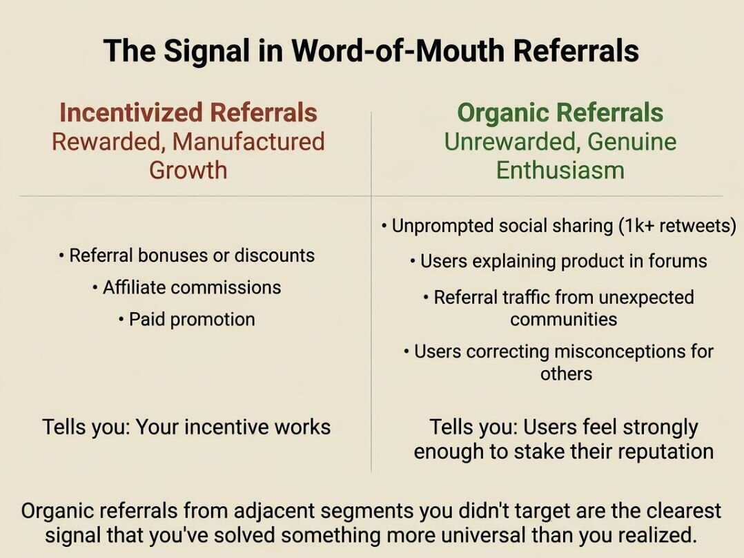
The strongest early signal I know is one you can't manufacture: unprompted word-of-mouth referrals. The genuine, unrewarded kind, where a user recommends your product to someone else because they couldn't help themselves. Incentivized referrals tell you that your incentive works. Organic referrals tell you that something about the product itself has crossed a threshold; that users feel strongly enough to put their own reputation behind it. That's a meaningfully different signal.
With Bolt.New, that came through with social chatter. We didn’t explicitly ask people to tell their friends about the product, but they did anyway because they love it so much, and our launch post received more than 1k retweets and hundreds of comments.
But sometimes, word-of-mouth referrals happen where you least expect it. Sometimes, you see referral traffic coming in from adjacent segments like Reddit, and that's a sign you've solved something more universal than you realized. In my experience, that's one of the clearest early indicators that you're onto something.
I saw this play out when we launched Dabbl, an app-only investing platform aimed at a much broader audience than traditional trading apps. We initially expected growth to come through paid acquisition and fintech press coverage. Instead, signups started appearing from personal finance forums and investing communities we hadn't targeted.
What surprised us wasn’t just the volume but the tone. Users were even explaining the product to each other, often correcting misconceptions and walking new users through how to get started. At that point we realised the product wasn’t just resonating with our intended audience, it had become something people were comfortable recommending publicly.
What your usage logs are really telling you
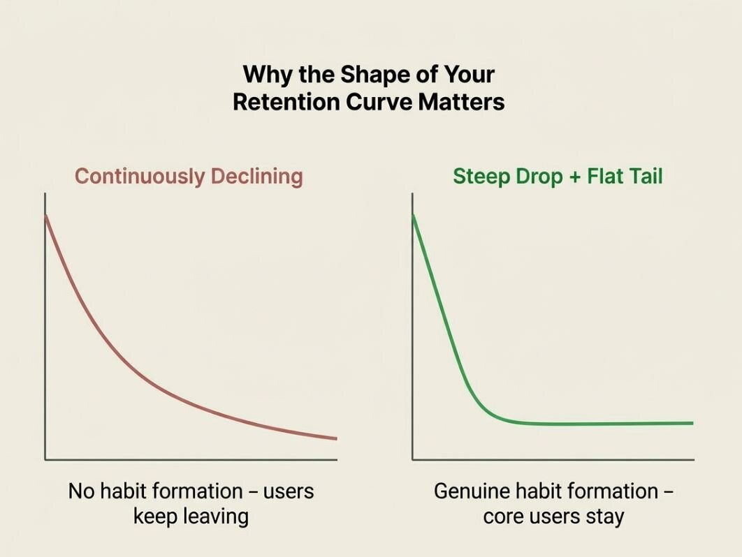
If word-of-mouth is the most intuitive PMF signal, usage patterns are the most underread. Most teams look at retention curves and feel relieved if they're not falling off a cliff. But the shape of the curve matters more than the slope.
What you're looking for is flatness. A retention curve that declines steeply and then levels out—even at a relatively small percentage—is telling you that a subset of users haven’t churned and are making your product part of their routine. That small flat tail is worth more than a large but continuously declining curve, because it shows genuine habit formation.
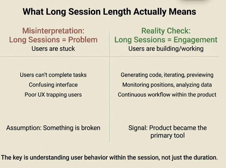
The second pattern is session duration. Specifically, sessions that run significantly longer than you expected or designed for. Longer-than-expected sessions can mean different things depending on context. In some products, it signals confusion and frustration. But if you see long session lengths, frequent return visits, and more actions completed, it tells you that users are going deeper than what you built for.
Dig into those segments of your audience. Understand who they are, how they’re using the product, and why their sessions run so much longer than you anticipated.
When I joined Bolt.new, one of the earliest signals that stood out in the usage data was session length. We expected users to complete a quick task like making a UI update and leave. Instead, some sessions were actively running for hours.
At first this looked like a possible UX problem. Long sessions can mean people are stuck. But when we dug deeper, we saw the opposite pattern: users were generating code, iterating, running previews, fixing bugs, and continuing to build inside the same session. It was clearly becoming an environment where people did the work.
And when we launched a mobile trading app at GFT Markets, one of the surprising metrics was how long users stayed in-session during volatile market periods. Instead of quick trade execution and exit, which was the typical pattern, many users stayed inside the app monitoring positions and market movements. It was an early signal that mobile wasn’t just a convenience channel, but was becoming a primary trading interface.
When angry users are actually your best news
This is the signal that trips up even experienced product leaders, because on the surface, it looks like bad news: you start to receive your first emotionally charged user complaints.
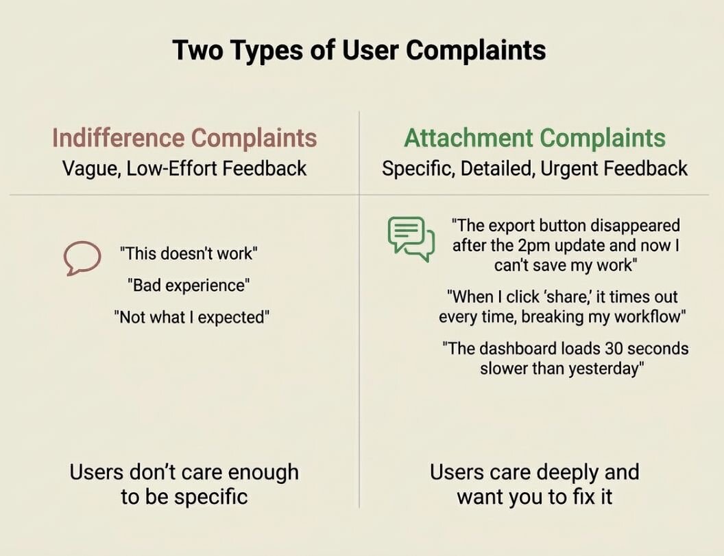
These complaints usually happen because there is an issue or something is broken, but below the surface, it tells you that someone cares. And users who care are users who are dependent on what you've built.
Think about it from the other direction. A user who is indifferent doesn't write a three-paragraph diatribe or an all-caps email. They just churn. But if you suddenly see hundreds of people complaining online about your systems being down, it means your product has become important enough to someone's workflow that its failure feels personal.
When I launched an on-demand pay product as part of a corporate venture, some of the strongest reactions came when payroll integrations failed or pay wasn't available when expected. The tone of those messages told us something critical: users were already depending on the product to manage real financial decisions. When a product reaches that point, the relationship changes. Users stop just evaluating it and start relying on it. That kind of dependency is one of the earliest real indicators of product-market fit. It’s the moment you realise you’ve crossed a threshold from optional to infrastructure.
The practical skill here is learning to distinguish between the two types of negative feedback. Complaints rooted in indifference tend to be vague and low-effort: "this doesn't work," "bad experience," "not what I expected." Complaints rooted in attachment tend to be specific, detailed, and urgent—users tell you exactly what broke, exactly when, and exactly why it matters to them. That specificity is a gift. It means they want you to fix it because they want to keep using it.
Building your early warning system
None of this is useful if you're waiting passively for signals to surface. You have to build lightweight habits if you want to catch them early.
As a starting point, I recommend creating a quick checklist of areas to keep an eye on. You don’t need a complex dashboard, but something substantive enough to see the patterns. Have a system in place to track:
- Referral source data on new signups — are people arriving via word of mouth, and from what segments?
- Support ticket sentiment over time— – is the emotional register of complaints changing?
- Session duration benchmarks against your own expectations
- Retention cohort curves charted over time
The cadence matters too. These signals move slowly enough that weekly check-ins are sufficient, but irregularly enough that if you only look quarterly, you'll miss the moment they appear.
The pattern is the point
What strikes me most, having worked across sectors that look nothing alike on the surface, is how consistent these signals are. The fintech user furiously emailing about a broken payment flow and the travel user evangelizing a booking experience to their entire friend group are expressing the same underlying things.
PMF is a pattern you learn to read through each stage of a product’s journey. The teams that find it earliest are paying attention to the right things. Start there.