
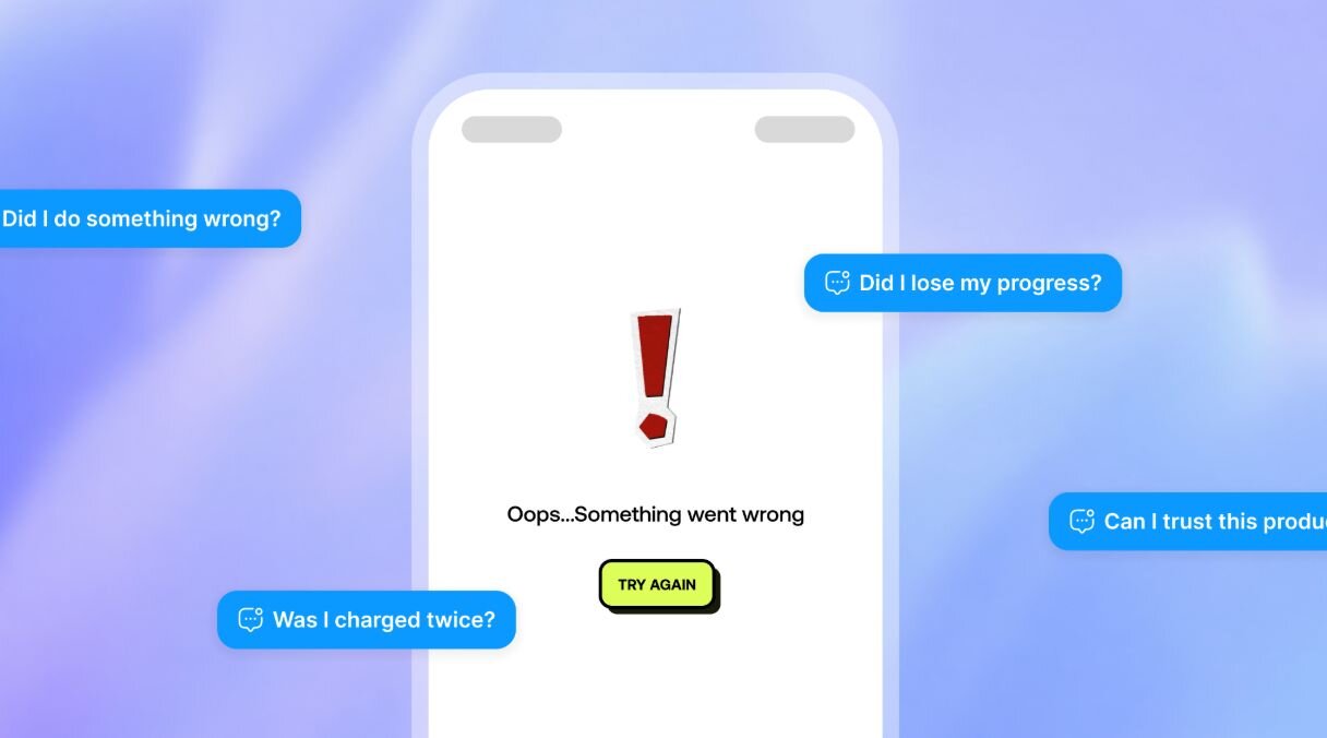
A user tries to complete something important. They upload a document, submit a form, or make a payment. The screen loads for a few seconds and returns one line:
"Something went wrong. Please try again."
No explanation. No guidance. No sign of whether their progress was saved. They try again. Same result. They close the product.
From the business side, this shows up as a drop-off. Someone blames the user. Someone blames a third-party provider. But the more useful question is why the product had no way of helping the user recover in the first place.
I started noticing this pattern early in my career, sitting in product reviews where the ideal journey had been picked apart for weeks, every micro-interaction considered, every transition debated. Meanwhile, the failure state would get a comment in Figma, a quick reply, and then ship. Not because people didn't care, but because failure felt like an edge case, something to come back to. In practice, coming back to it rarely happened. And in products where users are dealing with payments, verification, or account access, those unconsidered moments are often the ones that break trust for good.
Most product work follows the same sequence. Teams design for the best case, build out the success state, and add error handling close to the end. The problem is that error states then inherit screens that were never designed for recovery. They become interruptions, not moments of guidance. And for the user on the other side, a failed payment or a rejected upload does not feel like a small issue. They are wondering whether they lost their progress, whether they were charged, whether they can trust the product at all.
The real question is not only what the error message should say. It is what the product should do once the intended flow has broken.
Plan for recovery early
A recovery-first approach means mapping the most important failure points before the intended flow becomes too fixed to change around them.
For every key user action, ask what could go wrong, what causes it, whether the user can fix it themselves, and what happens if they leave mid-recovery and come back later. Not every edge case needs designing before launch. The priority should be errors that affect access, payments, identity, or the completion of a core journey. Those are the moments where a vague message does the most damage and where better recovery design has the most measurable impact.
What kind of failure is this?
Most products treat errors as either user errors or system errors. That distinction is a starting point, not a framework. A more useful approach classifies each failure across four areas before any design work begins.
Origin asks where the failure came from, a user’s input, an internal system, a third-party provider, or a background process. Users almost always blame the product in front of them, even when the cause is external. I have seen this happen in payment flows where there was a spike in complaints about failed transactions. The support messages named that particular feature specifically, not the processor, not the bank. It was only discovered days later that it was a third-party issue when the processor flagged it on their end. By then the damage had been done, because nothing in the user interface had given users any reason to think the problem was elsewhere.
Recoverability asks whether the user can fix the issue immediately, later, or not at all. A wrong password and a pending compliance review are both errors. They should look and behave completely differently from each other.
User control captures how much influence the user has over resolution. Full control means they caused it and can fix it. Partial control means they can take a next step but resolution sits elsewhere. No control means the failure is entirely outside their hands. Each of these needs a different interface response.
Time sensitivity determines urgency. A checkout failure needs immediate attention. A rejected document may block onboarding. A failed data export can wait. Urgency should shape how visible and persistent the error becomes.
Getting this classification done before design begins gives product, design, and engineering a common way to understand what went wrong rather than arguing about copy after users have already complained.
Match the response to the user's level of control
The most common mistake is giving the same instruction for very different types of failure.
When the user has full control, be specific. Naming the exact field and describing what is expected, a date format, a phone number length, a postcode pattern, gets someone back on track faster than a generic prompt to try again.
When the user has partial control, show the next step and set honest expectations. "Your document is being reviewed. This usually takes up to two hours and we'll notify you by email when it's complete." They have done what they can. The interface's job now is to close the anxiety loop and let them get on with their day.
When the user has no control, asking them to try again is not a recovery instruction, it is an exit prompt dressed up as one. Acknowledge the failure, confirm what is safe, and keep the relationship intact. "This is on us. Your payment has not been taken. We'll notify you when transfers are working again." That is a product taking responsibility rather than deflecting it.
One exception worth flagging: security-sensitive flows. In login or payment authentication, revealing too much can help someone probe the system. Keep the message appropriately vague in those cases, but still give the user somewhere useful to go.
Preserve context and design the return journey
When a user encounters an error and tries to recover, most products reset their context. The form clears. Uploaded files disappear. A multi-step process starts over. In long journeys, this compounds the original failure significantly. The more effort a user has already put in, the more damaging it feels when the product loses it without warning.
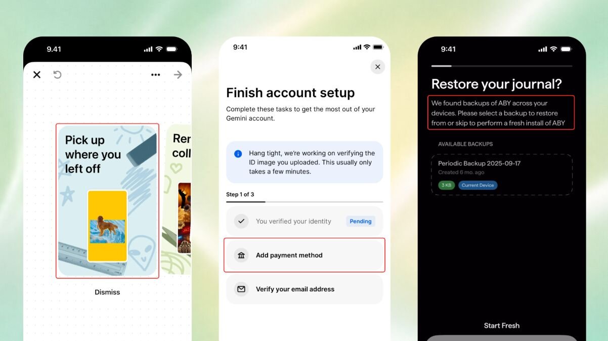
Keep completed fields populated where possible. Return the user to the exact point of failure. Retain uploaded assets across attempts. When context genuinely cannot be preserved, say so before the user discovers it themselves.
Many errors also go unresolved across sessions. A user may leave after a failed verification and come back two days later with no memory of exactly where they got stuck. The product should bring the unresolved issue back into view, a banner, a highlighted action item, a notification linking directly to the recovery point. A user who has to hunt for the problem they left behind has already started to lose confidence before they have done anything.
Bringing it all together
Start with the places where recovery is already failing. Support tickets, repeated retries, and drop-off points in your analytics tend to surface the errors that matter most, often before any design work is needed.
For each failure point, run the four-part classification: origin, recoverability, user control, time sensitivity. Then define who owns the recovery path. Sometimes that is the user. Sometimes it is support, operations, or engineering. Getting that ownership clear early prevents the situations where everyone assumes someone else handled it.
The signals that tell you it is working are probably already sitting in your product data: fewer support tickets for the same error types, fewer retries on the same flows, better completion rates on journeys that used to break. They become readable once recovery is treated as a product decision rather than something that gets sorted in a Slack thread the day before launch.
Every product fails at some point. The ones users stay with are the ones where, when something went wrong, it felt like someone had already thought about what would happen next.
