

As product managers, we are used to dealing with users: communicating with them, trying to understand their needs, showing them product ideas and getting their feedback. That’s at the core of what we believe product management basically is. We use several tools like user stories and personas, surveys and usability tests, A/B tests and experiments, and after some time we start to believe we know our users very well. Up until the point they show us something so different, so unexpected that we just sit there, stare at the screen thinking something like “Wow, really? That’s who you are…”.
We’d like to tell you six different stories about our products and the customers who use them, starting with these three tales of user growth at Mail.Ru. Although our user base is admittedly huge and geographically specific, we believe the ideas behind our stories are generally applicable for any product manager. We keenly remember the feeling of “Well that was unexpected”, and we want you to share it with us – and then think about your own products and your users. Before we start, let us introduce the products themselves: The first is the actual homepage of Mail.R – basically it’s the home page of the Russian internet with 15 million users daily (Russia, TNS, excl. other countries). The other is Mail.Ru for Business, a free-to-use email and collaboration business solution.
So, this is story time.
Unexpected audience growth
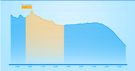
Mail.Ru`s homepage audience is so huge that there are really very few things that can result in instant growth. So of course, one day we saw unexpected and unusual audience growth on the homepage`s dashboards, the pageviews of both the mobile and desktop versions increased markedly:
We rushed to check what the reason could be. First of all we started looking for all kinds of technical problems – had JS errors increased? Or maybe the average page loading time, the other important technical indicator to us, became longer? We have noticed before that if users have technical problems they tend to refresh pages, and they keep doing that until the problem has resolved, so we also checked the rate-of-refresh graph.
We spent some time looking for potential problems, but everything was alright – we were completely stumped. Suddenly one of our colleagues passed by the office, and shared (very emotionally) his delight about the victory of the Russian football team. We opened the homepage again and saw that this football match was the main news item. Apparently the Russian football team had taken part in the championship, which was big news, and was headlining everywhere.
Sports Sells
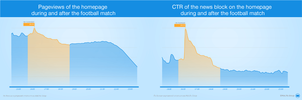
We checked this hypothesis, and it turned out that the CTR of the news “block” on the homepage had increased significantly at exactly the same time as the pageview spike. We also saw an increase in the number of clicks to social network links and in the number of search requests from the homepage. Just so you can appreciate the kind of differences we’re talking about, below you can see pageviews of the homepage during and after the football match on the left, and the CTR of the homepage news block on the during and after the football match.
It turns out that winning in some sporting event is one of the most popular topics on the web, and the only topic could potentially beat it is news about a defeat! We can also confirm first-hand that increases in audience numbers is a good “interest thermometer” – We were easily able to pick out the most interesting matches during the recent championship, just by paying attention to peaks and dips in our graphs.
Preparation is everything
Of course, the best thing about sports events (from our perspective) is the fact that you always know when they will happen, and so it is possible to be prepared. After that first case of unusual audience increases, we started to create special celebratory logos for the homepage, which would appear right after a victory in a match and congratulate our users.

After we realised just how much of an impact real-world events could have on our web traffic, we began to take peaks and dips on audience dashboards as more concrete signals of people`s interest in news and current events, teaching us what kinds of things we should try to anticipate in the future. For example, we noticed that people have a huge interest in presidential live speeches on TV. Specifically, during the speech there was a significant audience decrease in the Internet usage because many people stopped what they were doing online and switched to TV. As a response, we added online broadcasting from TV channels to our news services, and promoted the broadcast on the homepage.
What we learned
Peaks and dips on the audience graphs could show you not only some technical problems, but also what topics and events in the world are interesting for your audience. And some of them could be happening outside your product and even (significant if you’re working with a digital or web-based product) outside the Internet.
How we tried to optimize the funnel… and broke it
Let’s take a look at another product we are working on – Mail.Ru for Business. Basically it’s a service for business owners to connect their business domain name – like greatstartup.com – to Mail.Ru’s systems in order to create fully functional emails for all employees (for example oleg@greatstartup.com). In order to do that, a user needs to enter their domain name on the product’s homepage, click a big green “Connect” button, and then verify that they really own the domain rights.

And that’s where all the problems start. In order to verify the ownership of the domain name, a user has to perform some time-consuming tasks, like adding new DNS records or uploading specific HTML files to a server. These tasks are so hard to do that some users encounter them and immediately leave without even trying. So, in order to help those who got stuck or confused (perhaps even because they just don’t understand the meaning of the words DNS or HTML), we decided to reach them by phone.
The idea was to add an additional step to the verification process, right after clicking the Connect button, where we asked a user some basic personal information as well as their phone number. We decided to try and test this additional step for a small proportion of the audience, even without actually calling them, because we wanted to understand what the impact of this change would be on our conversation funnel.
Conversion 101?
There is a common product management tool – a conversion funnel – that helps us understand the number of users coming to our product, and the conversion rates for each step those users need to perform inside the product. If you’re not familiar with it, the metaphor of a funnel is used to describe the decrease in numbers that occurs at each step (due to users getting stuck, frustrated, bored or whatever). So, with that in mind, it’s would seem obvious that adding one more step to our on-boarding process would decrease the conversion rate further down our funnel, thus decreasing the final number of successful connections and active users. But by how much?
Before the test, we had three hypotheses:
- This additional step would result in a slight conversion rate decrease – about 30%
- The decrease would be drastic – up to 2-3 times
- We wouldn’t see any decrease at all
Any idea which result be you’d expect?

The (surprisingly) big reveal
The additional step didn’t decrease the conversion rate. It was increased it by up to 15%! And it was done just by asking a user to do just a little bit more, without actually calling to help them through the process. When we actually started to call them by phone and help, the conversion rate increased up to 30%.
So here is that “wow” feeling, again. And of course the question for us was “Why? Why did this additional step result in the increase in successful connections?”
As it happens, there is a psychological effect around time investment called “Escalation of Commitment”: People tend to continue doing something after they’ve invested some of their time and effort in starting it. So in our case, for some users it became much easier to justify pushing through the complex process and connecting their domain after clicking Connect button and then completing the simple form. They invested just a little bit more time in the form we’d added to the process, and it became harder for them to just stop and refuse to continue. Did we think about that before we conducted the test? Of course not! We didn’t expect any increase at all, but rather a measurable decrease.
What we learned
Measure and test everything and be ready to be completely wrong. Your users’ psychology plays a huge part in how successful your product is – not just your features. Understanding how people think can lead to great (or at least "sticky") products.
Unnecessary help with the verification process
Let’s get back to our “Mail.Ru for business” product, and the verification process that our users face while connecting their domain name to the system. During a redesign process (which product managers obviously love doing), our designer proposed a way to improve our verification process. This process is really hard for users, as they are supposed to go to their domain registrar site and perform some time consuming actions. Prior to the redesign, we had decided to help our users by presenting them with a link to a registrar-specific instruction article, including a step-by-step article, and then instructions of what domain-specific records should be added.

So the proposition made by the designer was simple: If we can already determine a domain’s registrant, why don’t we just get rid of the links to instruction articles, and instead present our users with a set of registrant-specific step-by-step instructions immediately? The idea was so simple and obvious that our first instinct was to implement it immediately, but it would involve transferring or rewriting several dozen article, and this could take some time. So, before we committed to all that work, we decided to take a MVP-ish approach and take only one article about one registrant (the biggest in the Russian market), and A/B test it in order to work out if this new approach was actually better for our users.

Start with one
So we implemented one change, showed it to the 50% of audience and tracked the conversion rate to successful connection for both groups of users. We were sure it would increase the conversion rate, but were curious about the actual effects. Would it double the conversion rate or just increase it a little bit? Or maybe, just maybe, we are all wrong and it wouldn’t change the rate at all?
Well we turned out to be (once again) dead wrong – the conversion rate dropped down to one third of the previous value (i.e. a decrease of 66%). We were so shocked that we were convinced we had run the experiment wrong, and we double-checked everything. But our results were accurate – immediately providing more detailed information about what steps a user should take to verify their domain seems to frighten them to the point where they decide the whole process isn’t worth it, and they leave the site completely.
Obviously this was completely at odds with anything we’d expected, so thank goodness we decided to implement this small MVP change and A/B test it! Not only did we save ourselves a lot of time and effort, but we managed to learn something new about our users.
What we learned
Even when you are right about prediction the change result, it’s always much more useful to test it via A/B experiment in order to know exact result of the product change. Even developers are always happy to know that the code they wrote resulted in the increase of the numbers of users. Remember that you can be always wrong. Spectacularly wrong, in fact. Doubt, test and measure everything.
The Real Lesson Thus Far
Even if you think you know your users very well, they still could easily surprise you. That this happens is amazing, and every surprise is insightful, showing us new opportunities to improve the product.
It’s crucial to be open to real data, real user behaviour and external events. Be ready to change your product to react to users’ new expectations, but also be open to the possibility of you being wrong. Don’t forget to double check your decisions, and be ready to test anything and everything possible. New real-life knowledge about your users will always result in a better product.