

- Everything Has a Design
- Building vs. Designing
- What is Good?
And there's more! As a Mind the Product member you can also join Scott for an AMA session on June 17th at 9am PDT. You'll find all the details on your membership dashboard.
1
Everything Has a Design
Everything in your life was designed by someone. Look at the chair you sit in, the software you use or the organization you work for: they were all made by other people. The boundaries of nations on maps and the names of the towns you’ve lived in were all chosen by people, too. Except for the natural world, if you look at everything you have ever loved, hated, used or purchased (and even the money you used to pay for it), it was all designed and made by human beings. Designers made hundreds of decisions over weeks, months or years to create these things in your life. They had many possible choices, but you only get to experience their final decisions, for better or for worse.
This is more than just an observation: it’s a powerful way to understand the world, and everything that happens. Consider the Notre-Dame cathedral in Paris, France. It took more than a century to make. Construction started in 1163 and wasn’t complete until 1345 (so if you struggle to plan for next month, don’t get into the cathedral business). Over the last six hundred years it has become one of the most popular works 4 how design makes the world of architecture, receiving thirteen million visitors annually, nearly twice as many as the Eiffel Tower.
On April 15, 2019, a fire started below the cathedral’s massive attic, spreading quickly through the aging wooden beams and rising up into the roof. Within an hour, the iconic rooftop spire, weighing 750 tons, collapsed, creating a blast of energy so powerful that it shut all of the doors inside the building. The fire was so intense that it wasn’t clear in the early stages whether the cathedral could be saved, but with heroic efforts by firefighters, it survived.

The cause of the fire is still unknown. However, we do know something about the design of its fire alarm system. As the New York Times explained:
The fire warning system at Notre-Dame took dozens of experts six years to put together, and in the end involved thousands of pages of diagrams, maps, spreadsheets and contracts . . .¹
This complexity would be the cathedral’s undoing. At 6:18 p.m. on the night of April 15, an inexperienced security employee, working an extra shift to cover for a coworker, saw a warning on the fire safety system. It first told him what quadrant of the building might have a fire in it, “Attic Nave Sacristy,” and then a code:
ZDA-110-3-15-1
It’s unclear how much of this message the guard understood. The code referred to a specific detection device, but there was no way the guard could have known how to use this code to locate the fire. The system wasn’t designed to make this easy to understand. And his job wasn’t designed with the training to close that knowledge gap. He did call the guard inside the church and asked him to investigate. The problem was that there were two attics in the cathedral, and the church guard went to the wrong one.
It took twenty-five minutes, as the fire spread quietly hundreds of feet above their heads, for them to realize their mistake. By the time the church guard climbed the three hundred steps to the main attic, the fire was raging out of control. They finally called the fire department, but the damage had already been done. The fire had been growing for at least thirty minutes in total, tearing through the attic’s wooden beams and support structures.
What good is a fire alarm system that’s hard to understand? Not good at all. We like to think that, here in the present day, with almost nine hundred years of technological progress from the time the Notre-Dame cathedral was designed, failures like this would be impossible. The truth is that designing things well isn’t easy to do. And as a result, things that are hard to understand or that don’t work well are made all the time. Often we just overlook them.
One classic example of bad design, often used as a cautionary lesson in professional design training, is what’s called a Norman door, named after usability expert Don Norman. It’s used so often in classes that many designers find it a cliché to mention it (if this is you, a twist is coming). In short, a Norman door is one that’s designed without regard for how people naturally interact with things in the world. Here’s an example:
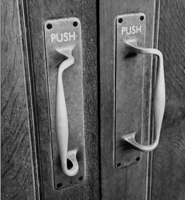
The problem with this door is the handle. Its shape tells your brain that you should grab and pull, like a handle on a briefcase or a car door. However, the door in this photo has a single instruction: PUSH. Which one is it then: push or pull? If we were looking at a Boeing 787 airplane cockpit or the controls for a Virginia-class nuclear submarine we would naturally feel overwhelmed, but a door is among the simplest machines in the history of civilization. We should have greater than 50/50 odds for opening it safely. A well-designed object is one we don’t have to think about. It makes the right choice the easiest one. But when we pull or push on a door and it doesn’t open we’re rightfully annoyed.
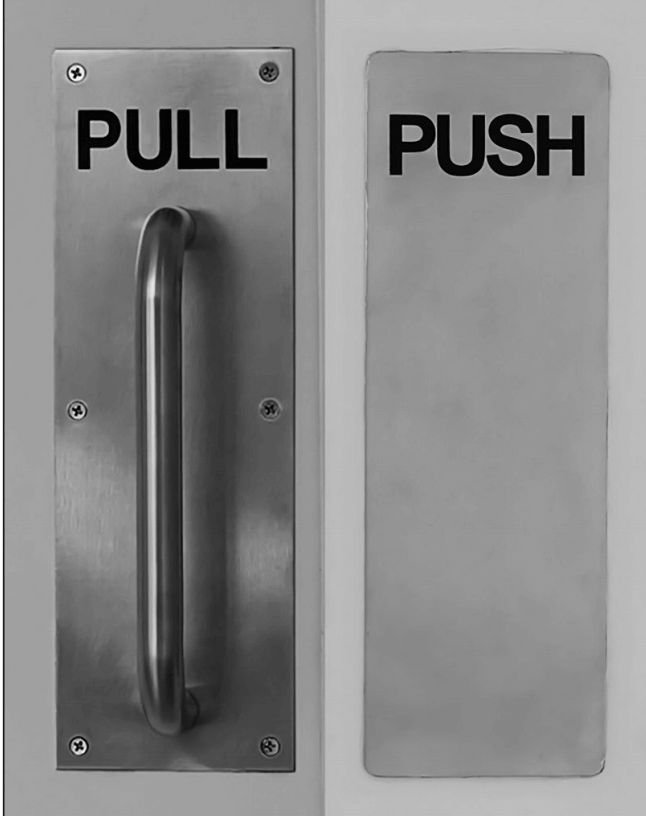
Once you start looking, you’ll find confusing doors everywhere. Many modern offices have glass doors with metal handles, but the handles rarely suggest which way the doors open. A better design, one that’s foolproof because it matches how people’s brains work, is this, where the shape of the panel itself, even without text, suggests what your hand should do:
But why then are Norman doors so common? Or, more importantly, why do so many things in our daily lives have flaws built into them? There’s likely something that annoys you about your apartment or home, perhaps a window designed not to open, a room that’s always too hot or cold or a noisy pipe that wakes you in the night. Maybe you use confusing software that often crashes, or take a two-hour commute in stressful traffic each day. It could be a plastic clamshell product package that’s impossible to open or a confusing government form you have to fill out. Perhaps, in more worldly moments, you wonder why war, crime and our climate-change crisis are part of the “civilized” world, despite how few people desire them. These things didn’t magically appear in our society one day. It’s the totality of all the choices people have made, perhaps accumulated over years or generations, that explains everything we experience, and defines who benefits and who does not.
Of course, no one intends to make bad things, despite how many of them there are. Which raises the question: why are so many things in the world, like Notre-Dame’s fire alarm system or Norman doors, not designed very well?
2
Building vs. Designing
To understand the world, we first need to acknowledge the state of the universe: it is designed to kill us. More precisely, as best as we can tell, it doesn’t care, or even know about us. We’re lucky just to be here. In all of the indifference of infinite space, there is just one pale blue dot, where, for the moment, we have inherited a habitat in which we can survive. This improbability, combined with our uncommon talents to make tools, grow food and transfer knowledge to future generations, all without killing each other (too much), explains why we’ve lasted this long. But this took effort to achieve. Except for nature’s gifts, we have rarely obtained good design for free.
In people terms, it’s useful to think of good design as a kind of quality, and higher quality requires more skill, money or time. This means that anyone who makes something is under pressure to decide how much of their limited resources to spend on which kinds of quality. Should it be more affordable? Should it be easier to use? Should it be more attractive? It’s hard to achieve them all. Running a business isn’t easy, and most people, most of the time, are looking for less work to do, not more.
To explore these ideas, imagine, as a simplified example, there is a company called SuperAmazingDoorCo. They pride themselves on their idea of quality: making sturdy, reliable doors. Let’s pretend they manufacture the door shown earlier, the confusing one, but they don’t know it’s confusing because sales have been good and they’ve heard few complaints. Their CEO is a proud businessperson who wants the company to be even more successful. To her, the company and its doors are designed well, since it’s making a profit and customers seem happy. The CEO hires you to be the project leader for a new version of their bestselling door. A team of experts at the company from across engineering, marketing and sales is brought in to work with you. In the first project meeting, some important questions come up:
- From engineering: Will the new door fit in standard office building doorframes?
- From sales: Will it look good in the online catalog?
- From marketing: Can it have optional locks? Customers want them.
- From the boss: Can we get this done before next year?
These questions seem fine, if shallow, at first, but something is missing. None of these questions will help the team learn about how confusing these doors are to use. This project will still build a door, but the odds are low that it will be an easy-to-use door, since no one has clearly defined what “a good door” means for the people who use it. Regarding ease of use, and most kinds of quality, often building things is easier than designing things.
This doesn’t mean building is easy. Building can be challenging work. Planning and installing the complex fire alarm system at Notre-Dame was very hard. But to build, as I’m using the word, means the goal is to finish building. To design, or to design well, means the goal is to improve something for someone. This means that just because you built the thing the right way doesn’t mean you built the right thing. That’s the missing question from the list: How well does the current door work for the people who use it? And how can we make it better? That is, assuming we decide to care about this kind of quality. As the world demonstrates, not everyone does.
This is where designers come in. Or, at least, where they should. Designers are experts at designing good things, and they use well-established methods to do it. Good designers, especially ones who care about the experience people have with what they create, depend on observational psychology and usability studies, actually watching real people as they try to use things to learn what confuses people. They also use knowledge derived from anthropology, fine art, psychology and engineering, and our ten-thousand-plus-year history of making things for people, from axes to arrowheads to mobile apps. That missing question from the project meeting is actually the first one that most designers, and design researchers, ask.
But many organizations don’t hire designers, so the questions that need to be asked never come up. And, as a result, the folks at SuperAmazingDoorCo proudly believe they make great doors, even though they don’t (at least as far as the people who try to open them are concerned). This is what psychologist Noel Burch called unconscious incompetence, where a person is unaware that they are bad at something (which may remind you of certain friends or coworkers).¹ The way they work, not observing customers or hiring good designers, keeps them blind from the truth and unaware of their incompetence. Much of the bad design in the world is the result of incompetence, unconscious or otherwise. As book designer Douglas Martin explains, “The question about whether design is necessary or affordable is beside the point. Design is inevitable. The alternative to good design is bad design, not no design at all.”²
Yet sometimes bad experiences happen because you’re using something that was designed to solve someone else’s problem. It’s like trying on a shirt two sizes too large or too small: the design itself might be OK for another person, but it’s a mismatch for you. Maybe all of the ones that fit you have already been taken, or it could be the designer’s failure to consider the sizes and genders of who they were designing for (unisex t-shirts don’t fit most women well, despite the name) or how many of each kind were needed.
In other situations, it’s just that the user and the customer aren’t the same. For example, SuperAmazingDoorCo doesn’t sell its doors to the people who use them to enter and leave buildings, it sells them to the owners of buildings. That customer might be happy with the doors, as they are sturdy, reliable and cheap. Or the architect prioritized stylish doors, or glass ones that allow more natural light, over easy-to-use ones. It’s only if that customer is motivated to care about the people who actually use the door, or the software, or the public transportation system, that things will change.
In other situations, we are a captive user or captive customer, meaning someone who has no other choice. If we work in a building with a Norman door, or go to visit family in a city only served by one bad airline, what recourse do we have but to use them? And as Laura Ballay, former director of Carnegie Mellon University’s Master of Human-Computer Interaction program, explained once in an online discussion we shared, “Business goals and user goals are often two very different things.” For example, Intuit, makers of TurboTax, is motivated to persuade the US government not to improve its tax forms, as that would hurt sales of their product.³
Often, hotel showers or the kiosks in pay parking lots have confusing designs because those businesses know it’s not worthwhile to invest in higher-quality ones: people don’t choose where to stay or park based on ease of use (it’s mostly location and price). Monopolies, governments and bureaucracies can fall into the habit of not making good things, simply because there’s insufficient skill, pride or competitive pressure to improve. It turns out there are many logical reasons, however sad they might be, for why good design isn’t as common as we’d like.
Beyond design quality itself, organizations often convince themselves that their work is better than it is. They reinforce their unconscious incompetence. Some do this with language, for example, calling themselves “customer centric.” But what does that really mean? There’s no official measure of, or license for, customer centricity. It’s just a label any organization can apply to itself at any time, without changing the quality of anything. And corporations, which are profit centric, are at best a balance between generating profits and satisfying customer needs.
A telling example of that balance is what happens when an organization makes you wait. This could be at a doctor’s office, a store checkout line or when you are put on hold when calling customer support. They know exactly how much it costs to hire another person to reduce waiting times, but they’ve chosen not to spend it. Perhaps they don’t think you’d be willing to pay more for better service, or they just want more profit. Either way, all too often, claiming to be customer centric is a kind of design theater: it’s just for show.
3
What is Good?
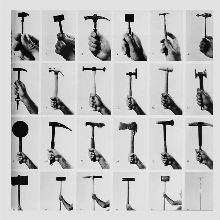
What would the best hammer in the world be like? Maybe you think it’s Thor’s hammer, Mjölnir, which flies into his hand whenever he asks. Or perhaps it’s a high-tech, voice-activated and power-assisted Bluetooth model, which counts how many calories you burn for each nail that you put in. But this raises a challenge: Thor’s hammer is for war. It’s designed to be a weapon, with a heavy weight to maximize damage. It’d be tough to use it to build a house. And that Bluetooth model would require electricity to work. It wouldn’t be very helpful if you were stranded on a remote island. It turns out there are hundreds of different designs for hammers, from the small to the gigantic, as artist Hans Hollein expressed in the amazing image below.
This means we can’t really say that something is well designed unless we identify what it’s going to be used for. The same exact hammer, or mobile app, or law, can be either good or bad, depending on which problem we are trying to solve. The very same object can be thought of as both a fantastic survival hammer and, say, a terrible bread knife or a horrible Frisbee. It’s easy to think a thing being “good” or “bad” is intrinsic to the thing itself. We often say “this is a good couch” or “these are great shoes,” but this is a dangerous line of thinking for people who make things. It assumes goodness and badness are defined by the thing, rather than by what the thing is used for.
Good designers ask two questions throughout any project to make sure the context is well understood:
- What are you trying to improve?
- Who are you trying to improve it for?
Asking the first question (which sometimes takes the form “what problem are you trying to solve?”) forces everyone to clarify the goal. If we don’t explicitly discuss the goal, we assume it is good and everyone has the same one in mind. That can lead to a goal mismatch: where different people on the team are working toward different goals. Perhaps someone thinks they’re designing a war hammer for the battle of Ragnarök, but the problem that needs to be solved is slicing bagels for the weekly staff meeting (where one hopes no battle takes place). Or it could be as simple as one person believing the mission is to improve durability but another is trying to lower costs, goals that are likely at odds with each other. Eventually, smart organizations learn how good designers are at discovering these problems early on, when they’re cheaper and easier to solve.
The second question is just as powerful. The designer of the Notre-Dame fire system assumed the guard would be someone who knew what ZDA-110-3-15-1 meant, which was not the case. This seems like an obvious mistake to us, but we didn’t do the work. When your job is to both design and build, it’s easy to get lost in the challenging work of building and forget the needs of the people you’re doing all the work for and how much less about the details of the problem they will ever understand than the builder will.
The improved door shown in chapter one is a more interesting example. It seems like a good solution at first, but are we designing for people in wheelchairs? Or who only speak Hindi? What about people who are very short, tall or wide? Or have arthritis in their hands? Or are carrying a stack of hot pizza boxes while looking at their mobile phone?
This all means we should resist judging how good or bad an idea is until we clarify the problem to solve and who we are solving it for. Of course, it’s convenient to not bother doing this. Who wants more work? Answering questions takes time. But skipping this step will leave you guessing about what good means. Sometimes guesswork in design is fine, like if you’re building a sand castle on the beach or making chocolate chip cookies without a recipe. If things go poorly, the stakes are low. But no one wants their artificial heart or the brakes in their car designed by guesswork—or the banking application they use to deposit their paycheck, or the airline website they use to book their family vacation (not to mention the airplane itself).
For fun, let’s say that SuperAmazingDoorCo has a change of business strategy. They decide to become more design mature, integrating design tasks into their decision-making. They hire a researcher to quietly observe and study people using their doors in different buildings. They learn about the confusion their doors create and wisely take responsibility (instead of merely accusing their users of being stupid, a copout bad designers often use). They realize that a better design is a business opportunity, a way to improve sales and compete with other door companies.
They decide on criteria, or requirements, for what a good door is, listing the most important problems and goals to solve. The list would look something like:
- Easy to install
- Sturdy and reliable
- Appealing, in style and price, to building owners
- Easy for most people to use for basic door tasks
- Made from sustainable and reusable materials
This list improves the odds that SuperAmazingDoorCo makes better doors. Every person who worked there could think about their tasks for the day and compare them against the list, making sure the tasks helped with one or more of the goals. If the Notre-Dame fire system had a goal that said “make it easy for inexperienced and exhausted guards to immediately identify where fires are and take the correct action” the resulting design would have been much better.
But this doesn’t go far enough. What does “easy to install” or “basic” actually mean? Without asking more questions, there’s too much room for interpretation and design theater becomes likely. Easy could mean it takes thirty seconds or thirty minutes, the difference between a minor disturbance and a catastrophe at Notre-Dame. And what are basic door tasks? Is it just opening and closing, or does it include holding the door open for someone? Is walking with coffee a basic task, or carrying a small child? Once you commit to good design and start thinking clearly, another layer of questions is always revealed. This is good. Good questions lead to more good questions, just as good thinking leads to more good thinking.
Our two questions mean that terms like user-friendly or intuitive are as flawed as customer centric. They don’t mean anything without context, and used generically they’re another form of design theater. And design theater can show up in unusual places. Take, for example, this bottle and how it describes itself to potential customers.

While grocery shopping I was surprised to see the phrase “Easy to Use” on food packaging at all. It’s strange at first to think of foods being hard or easy to use, but our survival has always depended on the design of food. An apple has edible natural packaging, fits in one hand and the less enjoyable parts are conveniently tucked away in the middle. Most of the packaged food in supermarkets has been cooked or processed to make it more convenient to eat. Compare this to a coconut or pineapple, which require tools and effort to make edible at all (an artifact of their own design goal of reproduction, as the hard shell of coconuts cleverly protects the insides from impact when they fall, and from animals after they land).
Even so, it’s strange to employ “ease of use” as a sales tactic for, of all things, dehydrated onions. More galling is that none of the facts listed have anything to do with usability at all. First, all forms of onions last longer in a pantry than in a refrigerator, so that first bullet is a deception. Second, having no preservatives might be good for your health, but it’s an attribute of the onions, not of how they are used. In truth, the two most easy-to-use aspects of these onions aren’t even mentioned: first, that they are diced and ready to go, and, second, that, since they’re dehydrated, the fumes onions release that make us cry have been eliminated!
This is mostly just bad marketing, but that’s the point: “easy to use” is a marketing term more than one good designers use. Ease of use can be measured, but only by comparison: time to complete a task, frequency of errors people make and success/failure rates are common criteria, but someone has to do research and measurement to justify these claims. “New and improved” is another common marketing cliché: being new doesn’t guarantee something is good. And if it’s improved, it could just mean that it has progressed from being terrible to being slightly less terrible, which isn’t much of an achievement.
A similar word is intuitive, which means a design is natural for people to use. The problem is that, unlike spiders or snakes, which enter this world with abilities like web spinning or slithering built into their brains, humans aren’t born with any notable skills.¹ We can’t sit up, talk or walk for weeks or months, and don’t do these things well for years. What we call “natural” depends on an accumulation of what we learn through culture.
For example, a car steering wheel feels intuitive today because cars have been popular for a century, and we’ve seen them used in movies and on TV. But if you had a time-travel machine and handed a steering wheel to the Notre-Dame cathedral builders in 1163, or to the neural implant cyborgs in 2855 who have direct neural-Matrix interfaces, they’d have no idea what it was or how to use it. It would be definitively non-intuitive. This extends to the meaning of even trivial-seeming design choices in the present. The color red means danger or di(culty in Western countries (“red tape,” “in the red”), but means joy and happiness in much of Asia. And the “thumbs-up” hand gesture is a positive sign in the West but is the equivalent of the middle finger in West Africa and the Middle East.²
We often fall into the trap of calling something intuitive if it makes sense to us, and call it hard to use if it doesn’t. This assumes that everyone has the same knowledge and culture (ours!). It’s an understandable trap: we are primarily emotional creatures. Frustration and delight are intense experiences that supersede logic. If we hold a prototype of a new mobile phone or video game controller in our hand and it feels natural, that positive feeling outweighs the desire to ask “how is my hand different from other people’s hands?” or “how can someone with no hands at all make use of this?” Asking those healthy design questions puts our own sense of pleasure at risk, forcing our emotions and our reason to be in conflict.
Thor has supernatural strength, so for him lifting his hammer feels easy and natural. Until he watched someone else try, and fail, it’d be easy for him to forget most people are not like him. Powerful people like executives and politicians often forget how distant their daily life experience is from what their customers’ and constituents’ lives are like. It’s no wonder so many things in life seem perfectly made for the people who made them, and few others.
Now You've Started…
Buy How Design Makes The World today and finish this great read! You can also check out Scott's other titles (he's the author of seven other books) including The Myths of Innovation, Confessions of a Public Speaker and The Year Without Pants. His work has appeared, in The New York Times, The Washington Post, Forbes, The Wall Street Journal, The Economist, The Guardian, Wired magazine, USA Today, Fast Company, National Public Radio, CNN, NPR, MSNBC and other media.