
Have you ever spent months testing and optimising a site and still found yourself falling short of targets? Or ever felt that your site satisfied CRO best practice and been unsure how to get the additional conversion boost you need? What do you do next? How about throwing best practice out the window and adding 37% to revenue per form visit?
Overview
VouchedFor is a rate and review site for financial advisers, accountants and solicitors – think TripAdvisor for professional services. A key offering of the service is allowing consumers to contact a professional through the site. After a site redesign and several months of intensive conversion rate optimisation, our focus was on the last step in the funnel; the contact form.
Two months running A/B tests to optimise contact forms had had a positive impact, with several tests producing significant uplifts in conversion rate including, for example, a 29% increase in form completion rate through a button wording change.
However, while satisfying most conventional best practices, conversion rate of the form was short of the target the team believed was achievable, and worse, we were running out of ideas. We were left with the following options – accept defeat and shift focus to a different area of site; continue down the path we were on with increasingly niche refinements or go back to the drawing board and come up with some great new ideas.
The Best Practice
It’s not hard to find a list of best practices based on others’ experiments – for example, http://conversionxl.com/53-ways-to-increase-conversion-rate/. These articles almost uniformly cite several optimisations that seem guaranteed to improve conversion, along with case studies where one of these changes has led to huge conversion gains, such as:
- Headline wording
- Buttons wording and styling – CareLogger adds 72% to conversion rate by changing headline and buttons
- Field styling
- Using tooltips to explain fields that users are less likely to complete
- Minimising the number of fields – Imagescape increases conversion rate 120% by shortening form from 11 to 4 fields
- Using social proof – Betfair increases conversion by 7% with social proof
- Including a special offer or exclusive benefit
- An explanation of what happens after the form is submitted
- Displaying privacy and security notices – OrientalFurniture.com increases conversion by including a security seal
With a form that satisfied all of these and more, we were starting to run out of inspiration for what we should do next.
The Original (Control) Form
Around 30 A/B tests had resulted in the following form:

Every element on the form had been tested at least once, with many having been through multiple variants that led to this design, and when compared with a best-practice checklist it scored pretty well.
The Insights
To gain an understanding of why this wasn’t working as well as we thought possible we focused our research efforts on our users. User research had highlighted that consumers were intimidated by financial advisers and concerned about coming across as uninformed when communicating with them; field-level Google Analytics data showed that, after those who exited the form without starting it, the highest drop-off stage of the form was the free text enquiry box; Inspectlet recordings showed users having issues with this area of the form, with many starting, deleting, retyping and finally abandoning this section.
Previous tests which changed the ordering of the form had made little difference to the completion rates of the different fields, with the enquiry message consistently the stage with the highest drop-off rate.
This enquiry message was a key business requirement as part of the offering to financial advisers, so removing it from the form wasn’t an option. Any future form would have to have a text box for users to include any important information about themselves.
The Hypothesis
Users find it easier to answer direct questions than to fill in a free text enquiry due to uncertainty over what to say and a fear of coming across as uninformed.
The Caveat
More than one variable was changed at the same time so this wasn't the perfect test. However, the insights gained from the test are still valid when considered in total.
The Tests
We decided to try a different direction. Instead of pursuing the concise version preached in the best practice guides, we decided to ask the user to supply much more information through a series of direct questions in the hope that users would find it easier to answer these types of questions than the enquiry box. If we could capture key information this way then it would reduce the importance of the enquiry box.
Test 1
A/B test of a new form (Variant A) against Control. The key differences between the Variant A and the Control were:
- Increase the number of fields, with up to 15 questions asked on the new form depending on the service selected
- All new questions required either a numerical answer and/or allowed the user to choose from some given options
- Use radio buttons or segmented controls instead of dropdowns
- Increase form length from 1 to 5 pages
The Result
As you might expect, Variant A performed worse than Control with a conversion rate 14.5% lower. However, some of the data suggested that it wasn't worth abandoning the hypothesis just yet.
There were two stages on Variant A with a high drop off – the first page, where users were asked to select a service to receive advice on, and the last page, where the user was asked to complete the enquiry form.
More surprising were the data points where Variant A outperformed Control. Stages 2, 3 and 4, where users were asked to provide their contact information and answer the detailed questions about their finances, each had a drop off of less than 10%. This meant that users who selected a service on Variant A completed the form at a very similar rate to users who selected a service on Control, despite having been asked to provide significantly more data.
The Next Insight
Users struggle to identify one single area on which they need financial advice. Often they need advice in several areas or aren’t able to answer a specific area. The fear of coming across as ill-informed or of misleading an adviser by selecting the incorrect service was deterring people from choosing one service. Once again this was backed up by Inspectlet recordings showing users struggling to settle on one service.
Test 2
A/B test of a new form (Variant B) against Control. Variant B built on Variant A with the following amendments:
- Allow users to enter more than one service on the first page
- Pre-populate the enquiry message with information gained from the questions the user had already answered, and give the user the opportunity to amend and add more information to the message.

The Result
A significant improvement in first-page completion rate (65% higher than Variant A) and an improvement in the completion rate of the enquiry form (8% higher than Variant A) led to a much higher form completion rate – 15% higher than Control and 36% higher than Variant A.
The majority of users edited or added to the pre-populated enquiry message.
Test Data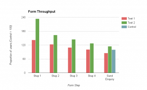

Overall Result
A 15% increase in conversion rate and an increase in revenue per enquirer thanks to better matching of consumers with advisers due to the additional data provided by users led to an increase of 37% in revenue per form visitor. What's more, the device category with both the biggest relative improvement and also now the highest absolute conversion rate was mobile.
The Learnings
Longer, more detailed forms asking the user for more information can increase conversion:
- Users were more likely to complete a five-stage form with multiple detailed questions than they were to answer a short one-page form.
- Users who were able to add more than one service converted at a much higher rate
Free text boxes are scary, particularly in a subject matter with high knowledge levels. Consumers find it easier to answer direct questions. When enquiry messages are required, giving the user a helping hand by suggesting what they could write helps.
Understanding users’ demand is as important as a great user experience and satisfying “best practice”. Gear conversion forms towards how the user is thinking, not the way you think about the questions.
The So What?
The internet is full of information about how to optimise conversion rates. Every major product, marketing, eCommerce and CRO blog contains articles on how to improve site conversion, many promising huge uplifts if you follow what they say. At times optimising a site can feel like a box-ticking exercise, with success ensured if you stick to the recipe prescribed elsewhere.
I hope our experience can help serve as a reminder that, as with all areas of product development, the right solution for your product could be completely different to the one that works for others, and the only way to find it is by putting your users at the core of whatever you’re making. Best practice articles can be a good way to get inspiration but they’re not guaranteed to be the right answer for you.